Design comparison
Community feedback
- @Moyo75Posted over 3 years ago
Good attempt. But it can be better.
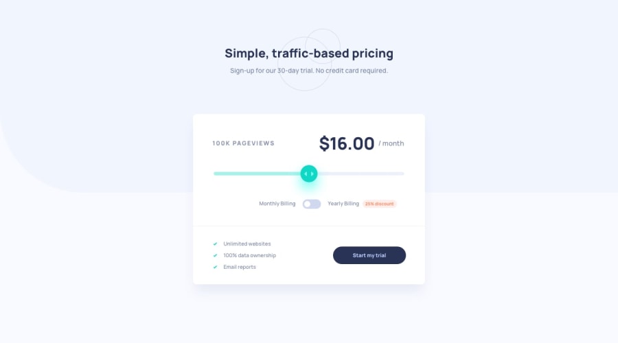
The toggle button seems displaced on the mobile view, also the texts flanking it should be on one line. Also the background of the discount percentage is a little blown up. The background color change in your slider seems to lag and doesn't seem to flow at all in some mobile screen sizes, though not when resizing manually.
The arrows on the slider thumb are missing. The circles and the light blue lay in the background too. I believe these assets/guides are provided in the starter files of the project and if you can fix these issues, you'll be close as possible to the design on both screens.
0
Please log in to post a comment
Log in with GitHubJoin our Discord community
Join thousands of Frontend Mentor community members taking the challenges, sharing resources, helping each other, and chatting about all things front-end!
Join our Discord
