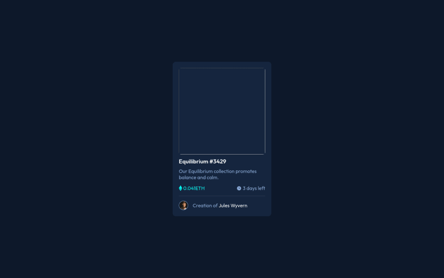
Design comparison
SolutionDesign
Community feedback
- @Illyaas4ShowPosted over 2 years ago
Hi, good job with this solution, Just some accessibility issues:
Document should have one main landmark- Your page should have one and only one<main>tag to help screen readers navigate the page.You can wrap your '.card' in a main tag.Page should contain a level-one heading- Your page should have one and only one<h1>tag to help screen readers navigate the page.- Also for some reason, the image isn't showing. You should try to check the paths to the folders if there is an issue there somewhere.
I hope this was helpful, Happy coding!
0 - @iprinceroyyPosted over 2 years ago
Hey @Lizzietrust, I would recommend seeing my solution to get an idea to structure the folder and files so that you can have your image.
0
Please log in to post a comment
Log in with GitHubJoin our Discord community
Join thousands of Frontend Mentor community members taking the challenges, sharing resources, helping each other, and chatting about all things front-end!
Join our Discord
