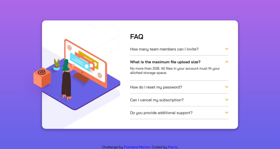
CSS Solution using CSS Flexbox and a mix of and background
Design comparison
Solution retrospective
I mainly used CSS Flexbox to properly position everything concerning the text.
I had some trouble on positioning the different svgs. I used a mix of img HTML tags and background css properties to do it. What would be the proper way of doing this? As we had different images for desktop and mobile sizes I used the background properties... but I had trouble positioning everything and mostly fixing everything (as you can see, it's moving a bit when opening a question or resizing the browser).
To open a question, I used JS to toggle an active class on the clicked question. Is there a full CSS way of doing so ?
Last point, how many media queries should be used here ? I used two, one for tablets and one for mobiles. I added one main breakpoint which is on tablets portrait mode here. A second one to adapt font size. What would be the best practices on this ?
Thank you! This is my first challenge here :)
Community feedback
- @brasspetalsPosted about 4 years ago
Hi, Pierre!
This was definitely a tricky one. I appreciate that you added animations to the arrows - it's a nice touch! 😄
If you wanted to do this without JS, I suggest using a "checkbox hack". Here's a link to the tutorial I followed when creating mine. I believe a similar method can be used with radio buttons if you wanted to only have one question open at a time.
0
Please log in to post a comment
Log in with GitHubJoin our Discord community
Join thousands of Frontend Mentor community members taking the challenges, sharing resources, helping each other, and chatting about all things front-end!
Join our Discord
