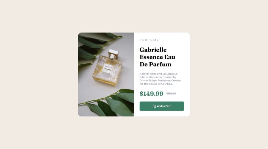
Design comparison
SolutionDesign
Community feedback
- P@giropa832Posted 5 months ago
Hi, good solution. Almost matched perfectly the design. Here is some feedback:
- When organizing your CSS file, bear in mind that order counts. Your media queries are scattered in the middle of different properties. I'd recommend having them properly placed at the end of the file.
- Use the proper tags on the HTML. You placed all the content within divs. That is not bad per se, however it might lead to a ton of rework when you try to optimize for SEO or accesibility. Using h1, h2, p, etc.. tags helps structuring your HTML better.
Godspeed!
Marked as helpful0
Please log in to post a comment
Log in with GitHubJoin our Discord community
Join thousands of Frontend Mentor community members taking the challenges, sharing resources, helping each other, and chatting about all things front-end!
Join our Discord
