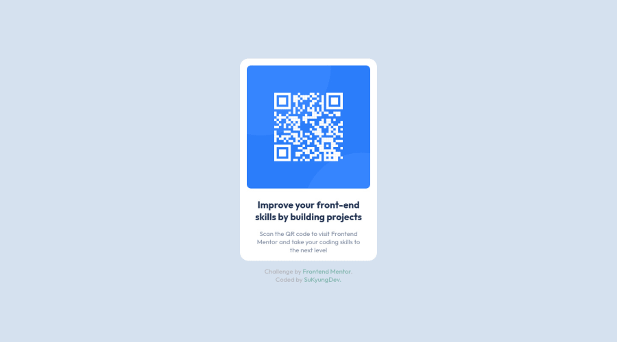
Design comparison
Solution retrospective
Challenges 01.
I wrapped all of the tags in div tags<class="container">. Is there any better tag than the div tag?
Community feedback
- P@claire-caPosted about 3 years ago
Hi @sukyungdev,
Well done on completing your first challenge here! It looks really good! The only thing you could do to make it closer to the design is adding a little more padding to the bottom of your section element. Also, there is a very slight box-shadow on the section element of the design as well which you could add - it is hard to see though, and I missed it myself first time!
With regards to the div tags you asked about, it's fine to use div tags here for your container as you've used appropriate semantic tags for your qr section and footer.
One other thing to point out is I noticed you've sized the qr img. A really useful tip is on any img to set max-width: 100%; on it. This stops imgs being bigger than their parent container and you wouldn't need to size your img here, as the parent container will stop it growing to be massive. It took me ages to realise this myself. Remove the width and height properties from your .qr-code and add max-width: 100% and see the magic!
Hope this helps! Really, well done on your first challenge - you've done great! Claire
Marked as helpful1@sukyungdevPosted about 3 years ago@claire-ca Hi @claire-ca! Thank you for your feedback! I didn't know there was a box-shadow. I will fixed it.
I set the size of the image according to your feedback(max-width:100%), and it was very effective. (see the magic!) This was a very useful tip. I'm very happy to know that.
Your feedback was very helpful to me. Thanks a lot. Have a good day!😄
1
Please log in to post a comment
Log in with GitHubJoin our Discord community
Join thousands of Frontend Mentor community members taking the challenges, sharing resources, helping each other, and chatting about all things front-end!
Join our Discord
