Design comparison
Solution retrospective
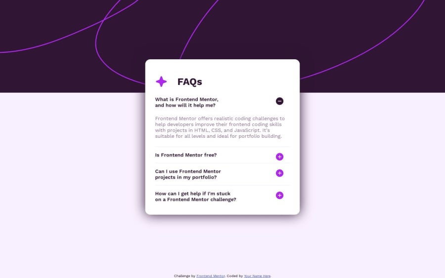
I'm happy I got bouncing indicators for the +/- button working. I'm also happy I was able to do it without any CSS.
I'm not super excited about the way I got the CSS for the background image to work. I'm not entirely sure it's a very scalable way to make sure that the elements are centered relative to one another correctly.
What challenges did you encounter, and how did you overcome them?Toggling the sections using a checkbox state was an interesting solution that it was interesting to try to adapt and also allow for the +/- button switch and bouncing icons on hover all with just CSS.
It might have been a good idea to try to make the height of the boxes a more "smooth" experience with animations, but from what I read that might have required JS so I skipped it for now since I'm currently trying to focus on HTML and CSS skills.
What specific areas of your project would you like help with?Ideas on improving the accessibility.
Ideas on improving the way to center the items compared to one another.
Community feedback
Please log in to post a comment
Log in with GitHubJoin our Discord community
Join thousands of Frontend Mentor community members taking the challenges, sharing resources, helping each other, and chatting about all things front-end!
Join our Discord
