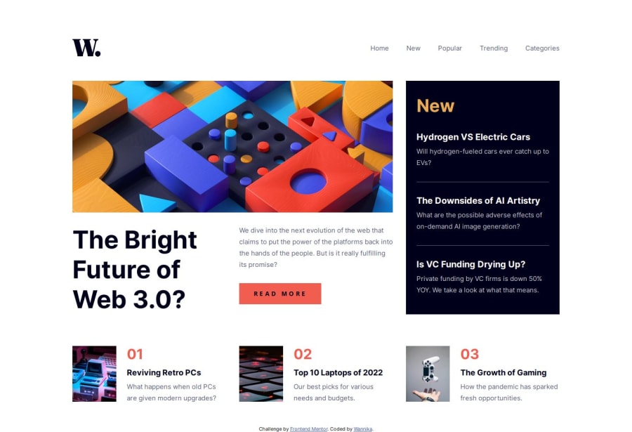
Design comparison
Solution retrospective
It's satisfying to build this with only CSS, but I don't know if it's simpler with JavaScript.
Community feedback
- @nataliesmythPosted 4 days ago
Wow, you did an amazing job! I think this is the most precise solution I've seen. The only small adjustment I would make is changing pixels to rems or ems for more flexibility.
1@Wannika123Posted 3 days ago@nataliesmyth Thank you very much. I really appreciate. :)
The design file helps me a lot with the precision. And I confess that I'm not comfortable using ems, but I normally use pixels (instead of rems) for side padding or margin so that when the user increase root size, it won't increase and narrow the space for the actual content (I learn this from Josh Comeau blog). But for the top/bottom padding or margin, it depends. Sometimes it's not the best decision on my part.
0
Please log in to post a comment
Log in with GitHubJoin our Discord community
Join thousands of Frontend Mentor community members taking the challenges, sharing resources, helping each other, and chatting about all things front-end!
Join our Discord