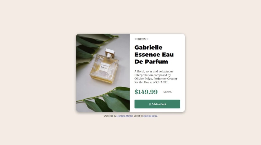
Design comparison
Solution retrospective
Happy to develop the challenge
What challenges did you encounter, and how did you overcome them?The challenges encountered had to do with the media queries, I always find it difficult
What specific areas of your project would you like help with?media quueries
Community feedback
- P@danielmrz-devPosted 10 months ago
Hello there!
Congrats on completing the challenge! ✅
Your project looks great!
I have a suggestion about your code that might interest you:
📌 You can use the
<picture>tag when you have different versions of the same image.Using the
<picture>tag will help load the correct image to the user's device, saving bandwidth and improving performance.Example:
<picture>
    <source media="(min-width: 768px)" srcset="{desktop image path here}">
    <img src="{mobile image path here}" alt="{alternative text here}">
</picture>
I hope this helps!
Other than that, excellent work!
Marked as helpful1@djdeveloper22Posted 10 months ago@danielmrz-dev Thank!! Daniel, Excellent appreciation, what a valuable contribution to my professional growth, I will put it into practice from now on :)
1 - P@coco390Posted 10 months ago
Nice design overall! I feel like your fonts are off a little bit though.
Marked as helpful1@djdeveloper22Posted 10 months ago@coco390 You are right about the text, thanks! I have already made the corresponding change and if you can observe again I would appreciate it.
0
Please log in to post a comment
Log in with GitHubJoin our Discord community
Join thousands of Frontend Mentor community members taking the challenges, sharing resources, helping each other, and chatting about all things front-end!
Join our Discord
