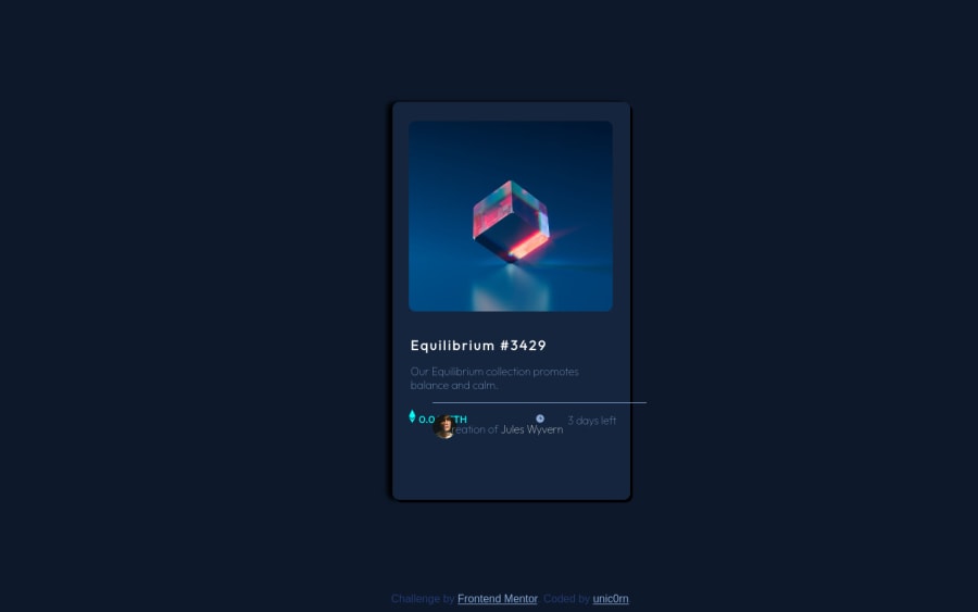


Design comparison
SolutionDesign

Solution retrospective
- still don't know how to make such a soft shadow as on original example, i searched everywhere, couldn't find it :(
- Hard for me to put <p> and icon or image in 1 line together. Somehow i did it but not sure if i did right.
- I couldn't make a white border on avatar picture. I tried "border-width" with "border-color" but it didn't work.
Please help me if you know how to do it. Thank you!
Community feedback
Please log in to post a comment
Log in with GitHub
Join our Discord community
Join thousands of Frontend Mentor community members taking the challenges, sharing resources, helping each other, and chatting about all things front-end!
Join our Discord