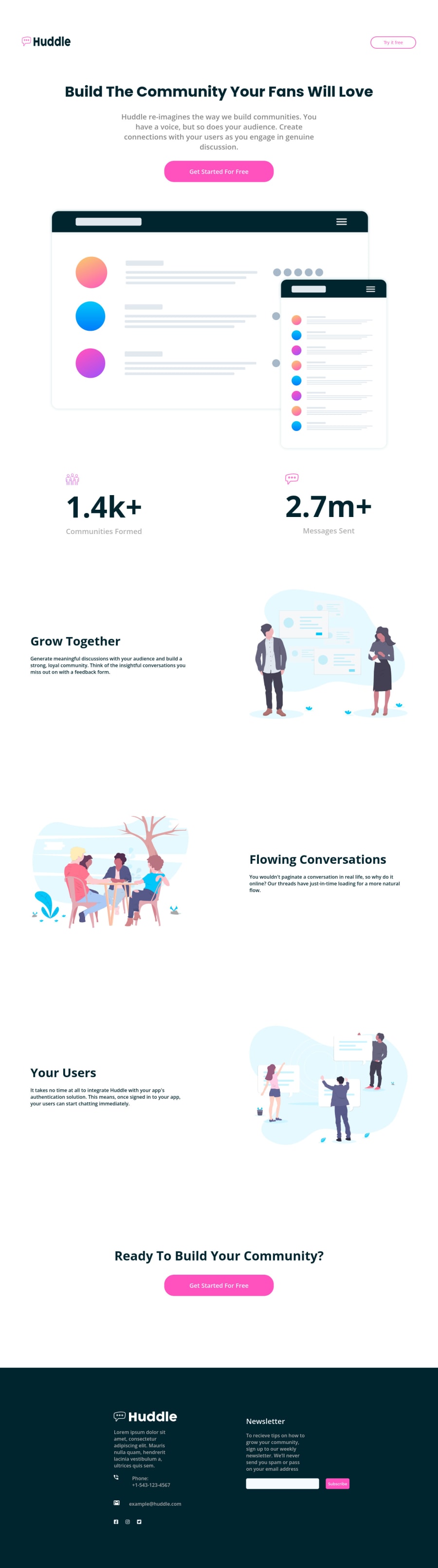


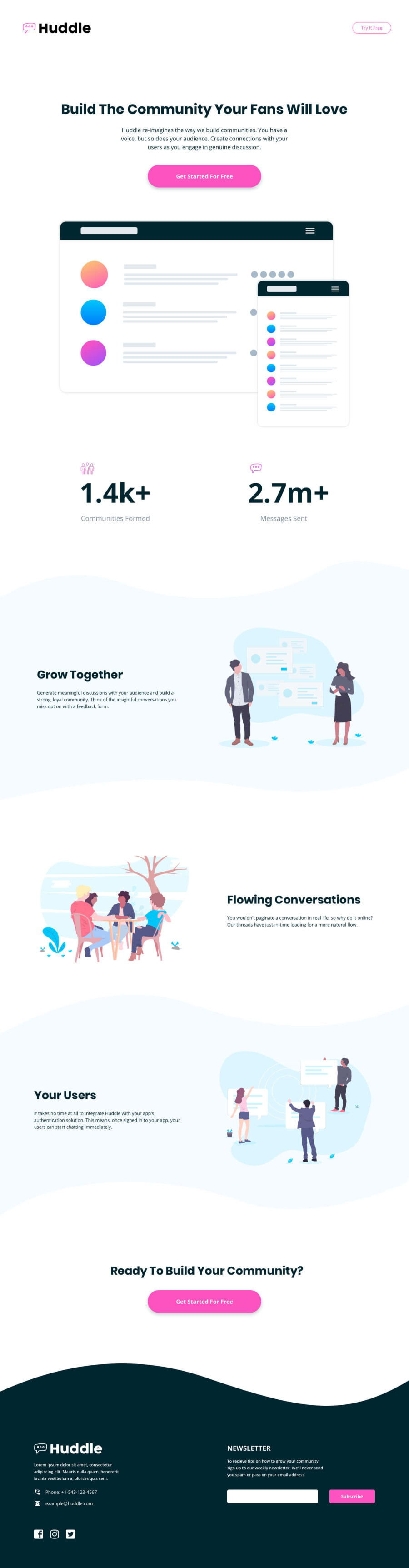
Design comparison
Solution retrospective
I was unable to implement the background curve section; could someone please assist me in resolving this problem?
Community feedback
- @mycrochipPosted over 2 years ago
Hello @CoreThread,
You've put commendable effort into your solution. However, there is room for improvement.
Firstly, it would be good practice for you to have a certain
containerclass nested within your<section>or any element that acts as a section. This ultimately helps with alignment (like aligning your footer with the main content, if they have this same nested 'container' class or wrapper). Then a styling like the one below could be applied:.container { width: clamp(320px, 90%, 1240px); margin: 0 auto; }Here, we always want a 5% margin on each side while not being smaller than 320px and not exceeding 1240px in width
I usually do not give such help as below, but explaining how each background image can be placed would seem rather too difficult and defeat its purpose of making things simple.
Below, is a code snippet from my version of the project submitted a few hours ago. You will still need to study it a bit as classes incorporated in your HTML code might be different.
The backgrounds have varying
background-sizeproperties, hence the headache. One section even has multiple background images.:root { --clr-primary-1: hsl(322, 100%, 66%); --clr-neutral-500: hsl(207, 100%, 98%); } /** Background Image and Color */ /*** Individual Sections BIC*/ .main, .community-stats { background-repeat: no-repeat; background-size: contain; background-position: bottom; } .main { background-image: url(../images/bg-footer-top-mobile.svg); } .community-stats { background-image: url(../images/bg-section-top-mobile-1.svg); } .hero-btn, .section-btn { background-color: var(--clr-primary-1); color: var(--clr-neutral-1000); } .grow-together, .your-users { background-color: var(--clr-neutral-500); } .flowing-conversations { background-image: url(../images/bg-section-top-mobile-2.svg), url(../images/bg-section-bottom-mobile-1.svg); background-repeat: no-repeat, no-repeat; background-size: contain, contain; background-position: bottom, top; } .ready-to-build { background-image: url(../images/bg-section-bottom-mobile-2.svg); background-repeat: no-repeat; background-size: contain; background-position: top; } .communities-formed__tag, .messages-sent__tag { opacity: 0.7; }Fortunately, the same applies to desktop sizes. Just replace the words 'mobile' with 'desktop' in the background images
0

Please log in to post a comment
Log in with GitHub
Join our Discord community
Join thousands of Frontend Mentor community members taking the challenges, sharing resources, helping each other, and chatting about all things front-end!
Join our Discord