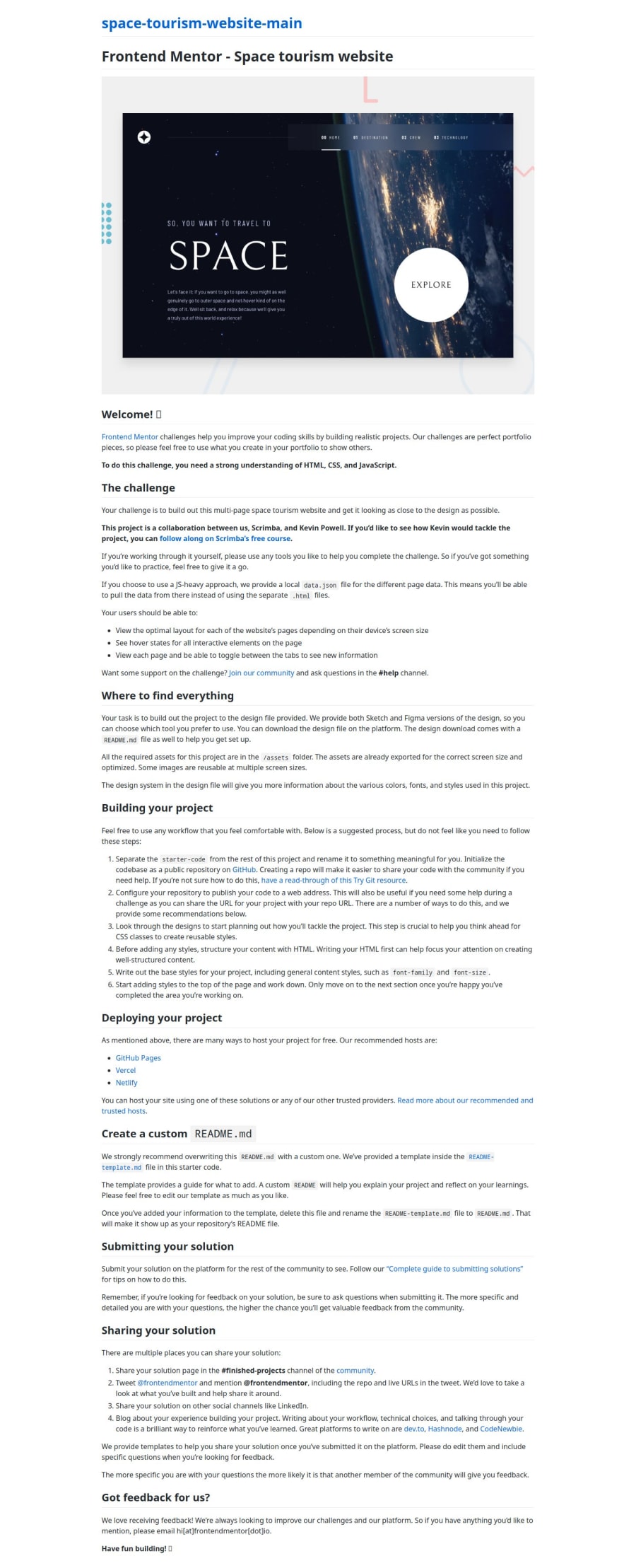
Design comparison
Solution retrospective
Well I am proud that I am building multi-page websites, I would try to write less CSS code, I think I wrote abundant CSS code.
What challenges did you encounter, and how did you overcome them?This was first multi-page project I coded so there were a lot that I didn't have prior knowledge of, for example I didn't know how to work with Figma. I Watched some YouTube tutorials of it !!!
What specific areas of your project would you like help with?There are still some issues in my code that I will improve in the future, let me know if you see any issue !
Community feedback
- @1deadjoePosted 6 months ago
This code exhibits a solid structure and adheres to modern HTML and CSS best practices. The use of semantic elements, such as <header> and <main>, enhances accessibility, and the inclusion of ARIA attributes demonstrates a commendable focus on usability for all users. The responsive design is well-handled with media queries, providing a seamless experience across devices.
However, there are areas for improvement. The navigation lacks clear labels for the toggle button, potentially confusing screen reader users. Additionally, inline styles within the HTML and overly complex class names may hinder readability and maintainability. Simplifying class names and enhancing documentation would improve the code’s clarity.
0@samir-DevePosted 6 months ago@1deadjoe Thank you for reviewing my code, I will not omit your suggestions next time, thank you for putting time to see my project !!!
1
Please log in to post a comment
Log in with GitHubJoin our Discord community
Join thousands of Frontend Mentor community members taking the challenges, sharing resources, helping each other, and chatting about all things front-end!
Join our Discord
