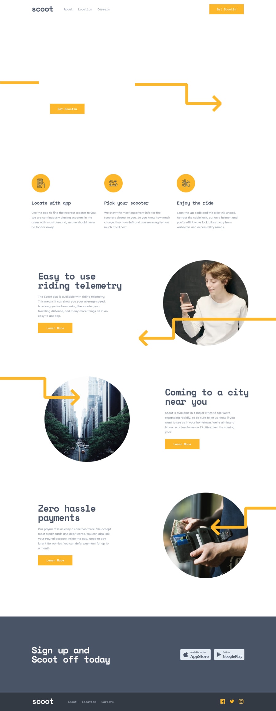
Design comparison
Solution retrospective
This project did not seem very difficult to me but i had fun. All suggestions are welcome!!)
Community feedback
- @jNembhardPosted over 2 years ago
Site looks good!
Couple of fixes: on the laptop layouts the About link in the footer bleeds over the Scoot logo.
When your pages get wider than 1440px, the layouts get screwed up. Set a max width of 1440px for each section and then use margin: 0 auto; to keep the page centered. at larger sizes.
The main image on the landing page only loads sometimes for some reason on my end.
To make this even better you could try playing with animations. It's not necessary but is definitely a way to make your site stand out even more. Great work though!
0
Please log in to post a comment
Log in with GitHubJoin our Discord community
Join thousands of Frontend Mentor community members taking the challenges, sharing resources, helping each other, and chatting about all things front-end!
Join our Discord
