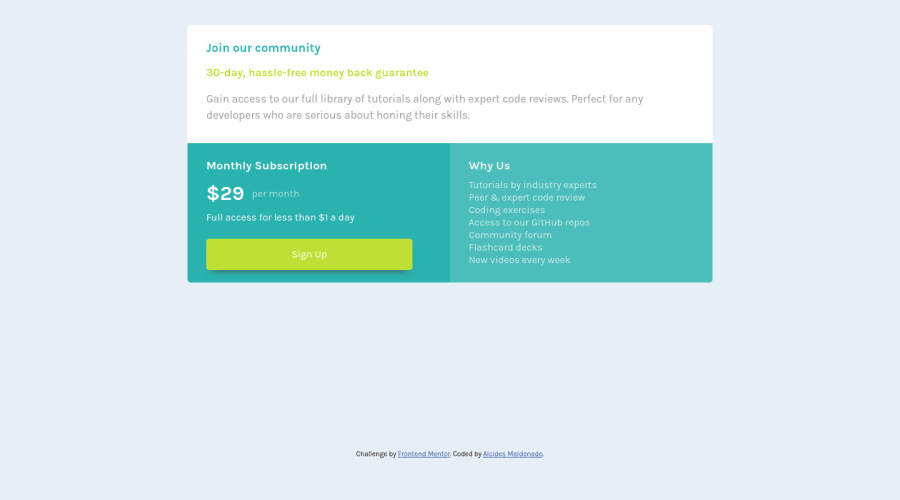
Design comparison
SolutionDesign
Solution retrospective
Did my best, be nice to this noob pls :c. If you have any trick to center a grid element I would appreciate it if you share the ancient knowledge with this poor guy. Bless.
Community feedback
- @ApplePieGiraffePosted over 3 years ago
Hello, Alcides Maldonado! 👋
Nice job on this challenge! 👏
A few things I'd like to suggest are,
- Adding a max-width to the card component to make sure that it doesn't look too wide in the desktop (or when the layout first switches from desktop to mobile).
- Perhaps only adding
type="submit"
to a button that's inside a form. In this case, an anchor tag might work better for the "Sign Up" element (since it feels like it would the user somewhere, like to a sign-up page, when clicked). - If you'd like to work on getting your implementations closer to the original design, check out this extension called PerfectPixel. It allows you to overlay an image on top of your website (which, in this case, can be the design JPGs that come with the starter files) so that you know exactly how your solution lines up with the design. 😉
Hope those few tips help. 🙂
Keep coding (and happy coding, too)! 😁
Marked as helpful0@AlatmalPosted over 3 years ago@ApplePieGiraffe thank you so much. Your comment is gold.
1 - @AlatmalPosted over 3 years ago
Dear lord, I never get it right with the dimensions of the preview window for these challenges. Can anyone help me with this, please?
0
Please log in to post a comment
Log in with GitHubJoin our Discord community
Join thousands of Frontend Mentor community members taking the challenges, sharing resources, helping each other, and chatting about all things front-end!
Join our Discord