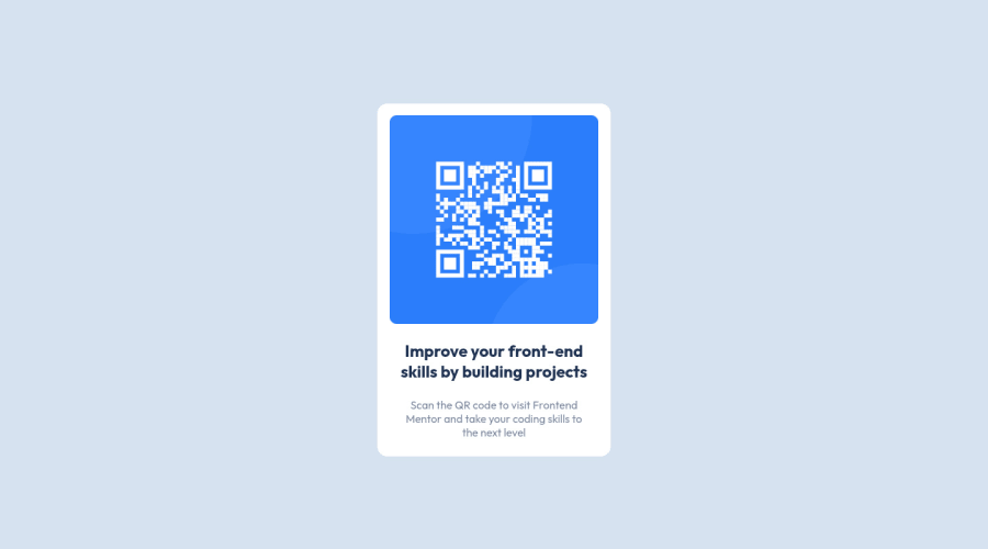
Design comparison
Solution retrospective
Salutations!
This project wasn't bad. I learned a couple things along the way. I'd love to learn more so I you have a way to refactor my code or provide a better method or two I am all ears!
Thank you!
Community feedback
- @kenreibmanPosted about 3 years ago
Looks great! Good job on the submission.
I recommend staying away from setting a fixed
width, as there are times you might run into issues with responsiveness.I would start using
max-widthfor setting the width of containers.Great job on the use of proper HTML5 semantics tags, and the use of rems! Since you already have a good understanding of not using px and instead using rems, I'm going to send you this article that might be interesting for you to read.
Although I really recommend you to read it, summarized, the article talks about the benefits of setting the base font-size to
62.5%which basically makes1rem=10px.Now you might see the pattern, and how rems become much easier to handle. If you want a
255pxcontainer, just set it to25.5rem.Just a little advice in addition to your first submission. Great job, and keep it up!
0@Gareth-MoorePosted about 3 years ago@kenreibman Thanks a ton Ken. I actually just completed the second challenge and I used your advice. I makes a wonderful difference by taking out the guesswork when using rems.
I also used the max-width property instead of just width. But when I was testing it I couldn't see what the difference was. Do you know of any particular circumstances it would be a problem?
Thanks again for your help. It's much appreciated! Gareth
0
Please log in to post a comment
Log in with GitHubJoin our Discord community
Join thousands of Frontend Mentor community members taking the challenges, sharing resources, helping each other, and chatting about all things front-end!
Join our Discord
