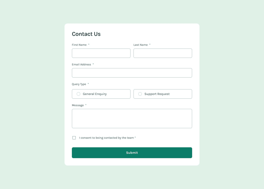
Design comparison
SolutionDesign
Solution retrospective
What are you most proud of, and what would you do differently next time?
...
What challenges did you encounter, and how did you overcome them?I did not face any challenge, it was fun to code this project. I coded it a little bit different than original design, so keep it in mind when reviewing the code and design :)
What specific areas of your project would you like help with?Any suggestion is appreciated !
Community feedback
- P@srijanssPosted 8 months ago
- <fieldset> element is used to group the inputs but the legend is missing for some fieldset. <legend> element must be added inside fieldset so its announced to screen reader user what the group is about.
- similarly there are two header tags in one page, so there is the possibility of confusion on these headers
- all the elements on the page are not using keyboard, specially the radio buttons have no outline when focused
- layout looks good on all range of screen sizes
- coudn't access the github solution page, so didn't get the chance to review the code
0
Please log in to post a comment
Log in with GitHubJoin our Discord community
Join thousands of Frontend Mentor community members taking the challenges, sharing resources, helping each other, and chatting about all things front-end!
Join our Discord
