


Raymart Pamplona• 16,120
@pikapikamart
Posted
Hey, great work on this one. Desktop layout looks really great, it is responsive as well and another idea to add is that, instead of just showing the mobile view on a breakpoint, maybe create something like 2x2 layout so that it will be more seamless and not just desktop view to mobile view.
Some other suggestions would be:
- It would be great to have a base styling of this:
html {
  box-sizing: border-boxl
  font-size: 100%;
}

*,
*::before,
*::after {
  box-sizing: inherit
}
This way, handling an element specially its size will be easier because of the box-sizing
- Avoid using
height: 100vhon a large container like thebodyas this makes the element's height capped based on the viewport/screen's height. Instead usemin-height: 100vhso that the element will expand if it needs to. - Remove the
headerinside themainso that it will sit on its row as it is one of your primary landmark:
<header />
<main />
- Also the
headerdoes not need extraalt. - Avoid using
idto target and style an element since it is a bad practice due to css specificity. Instead, just useclassto target element. - This text
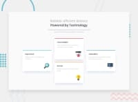
Reliable, efficient delivery Powered by Technologyshould be wrapped in a singleh1tag. Then usemax-widthon it until the text wraps on its own row like on the design. - Use
divinstead ofsectionsincesectiononly does not give extra information unless it is labelled byaria-labelledBy. - Each card title could be wrapped by heading tag like
h2since it gives information on what the section would contain. - Also, when wrapping up a text-content, make sure that it is inside a meaningful element like
ptag or heading tag and not using likediv, spanto wrap the text. - Those 4 icons are only decorative so better hide them. Decorative images should be hidden for screen-reader at all times by using
alt=""andaria-hidden="true"to theimgtag or onlyaria-hidden="true"if the image is usingsvg. - Only use descriptive
alton images that are meaningful and adds content to the site otherwise hide the image for screen-reader users. - Lastly, when using
imgtag, you don't need to add words that relates to "graphic" such as "image" and others, sinceimgis already an image so no need to describe it as one.
Aside from those, great job again on this one.
Marked as helpful
0
