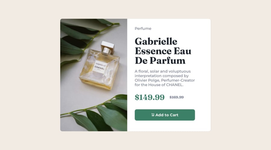
Design comparison
SolutionDesign
Solution retrospective
estou disposto a receber soluções diferentes ou correção de bugs
Community feedback
- @anar-solPosted about 1 year ago
Hello =)
If you want to include the image as HTML content instead of using CSS
background, you can usepictureandsourceto specify different images for mobile and desktop depending on the viewport size.In my solution, I've set the mobile version as the default image and the desktop one starting at
640pxwidth viewport.<picture> <source media="(min-width: 640px)" srcset="images/image-product-desktop.jpg" width="600" height="900"> <img src="./images/image-product-mobile.jpg" alt="Gabrielle Essence Eau De Parfum bottle" width="686" height="480" class="card__image"> </picture>As you'll see in these MDN and web.dev articles, there are many other situations where
pictureandsourcecan be useful.Marked as helpful0@joseildoandrade12Posted about 1 year ago@anar-sol VLW MANO NEM LEMBRAVA MAIS DESSA FORMA KKKKKKKKKKK
0
Please log in to post a comment
Log in with GitHubJoin our Discord community
Join thousands of Frontend Mentor community members taking the challenges, sharing resources, helping each other, and chatting about all things front-end!
Join our Discord
