Design comparison
SolutionDesign
Community feedback
- @3laagaberPosted 5 months ago
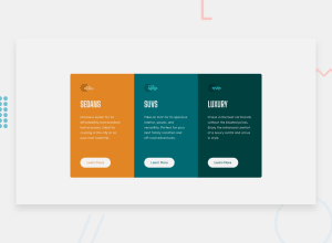
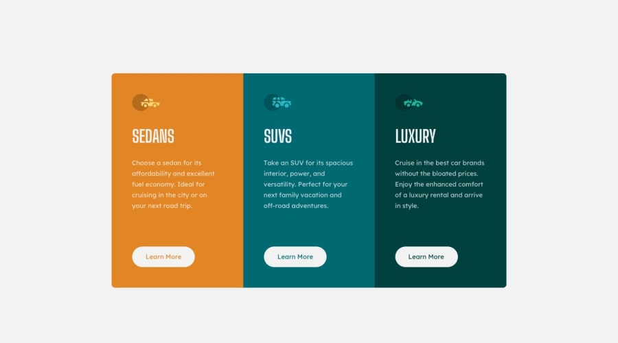
Hello, @RewaaGaber good job there are some things to do to enhance your design : First: your container is smaller than the target design. Second: for the button below, you should make the color of it similar to the color of his section it's not white in the three sections, and I think its original background is white not just at hover. Finally: change the body's background to the color he gave you. I hope these suggestions help you and I wish you the best.
0@RewaaGaberPosted 5 months ago@3laagaber thank you for your feedback! About suggestion, I will do it. If you have any other suggestions feel free to text me!
1
Please log in to post a comment
Log in with GitHubJoin our Discord community
Join thousands of Frontend Mentor community members taking the challenges, sharing resources, helping each other, and chatting about all things front-end!
Join our Discord
