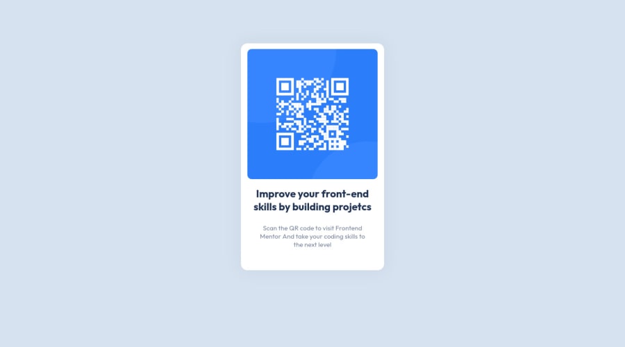
Design comparison
SolutionDesign
Community feedback
- @denieldenPosted almost 3 years ago
Hi Augusto, congrats great job!
I had a look at your final solution and I have a few suggestions for you that I hope will be useful:
Note: Flexbox aligns to the size of the parent container.
For center the card give flexbox and
heightproperties to the parent node of card.You can use the
vhmeasurement for the height... Viewport Height handles the sizing of an element in relation to the height of the browser window.Hope this helps. Happy coding!
Marked as helpful1@gutim2Posted almost 3 years ago@denielden hey, it will help yes and a lot, I'm new to the codes.
I'll take a look at this tip.
1
Please log in to post a comment
Log in with GitHubJoin our Discord community
Join thousands of Frontend Mentor community members taking the challenges, sharing resources, helping each other, and chatting about all things front-end!
Join our Discord
