Design comparison
Community feedback
- @correlucasPosted about 2 years ago
👾Hello @Kishp73, Congratulations on completing this challenge!
Great code and great solution! I’ve few suggestions for you that you can consider adding to your code:
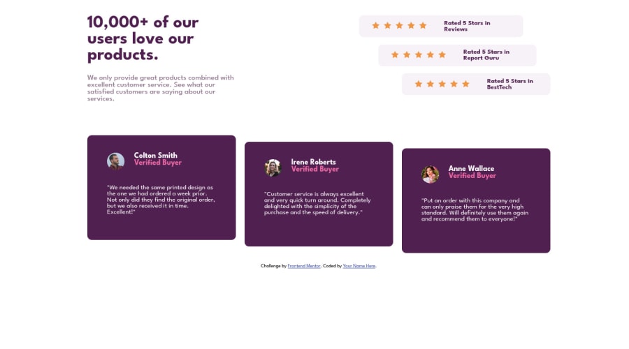
1.You did a really good work here putting everything together, something you can improve its your code html markup and semantics. You can replace the
<div>that wraps each card with<article>you can wrap the paragraph with the quote with the tag<blockquote>this way you'll wrap each block of element with the best tag in this situation. Pay attention that<div>is only a block element without meaning.This article from Freecodecamp explains the main HTML semantic TAGS: https://www.freecodecamp.org/news/semantic-html5-elements/
2.To add the two
wavesvg background images in the (top/bottom),, the best way is by usingbackground-imageto manage it since adding them to thebodyyou make sure it will be under everything, to manage different images inside a single css property asbackground-imageyou use the comma inside each properties declare the single modification for each wave svg image separated. See the code below to see your solution with those backgrounds applied:@media (min-width: 1120px) body { background-image: url(./images/bg-pattern-top-desktop.svg), url(./images/bg-pattern-bottom-desktop.svg); background-position: left -185px top -236px, right 10px bottom -300px; background-repeat: no-repeat; background-attachment: fixed; background-size: contain, contain; margin: 10px 10px 10px; display: flex; flex-direction: column; justify-content: center; align-items: center; }✌️ I hope this helps you and happy coding!
2
Please log in to post a comment
Log in with GitHubJoin our Discord community
Join thousands of Frontend Mentor community members taking the challenges, sharing resources, helping each other, and chatting about all things front-end!
Join our Discord
