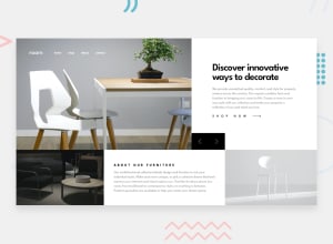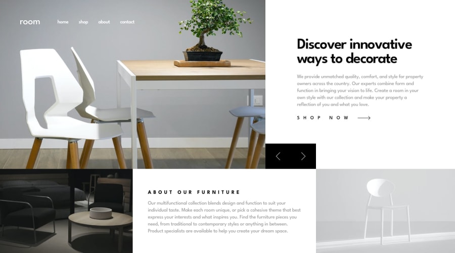
Design comparison
SolutionDesign
Solution retrospective
This is my first attempt on this challenge, i would like to hear tips to improve the mobile menu, i think that it is terrible by now...
i will also try to improve the slider component so the content changes smoothly, do you guys have any tip for this? I think that i made a mistake by using background-image instead of html <img> for this... what do you think?
Thanks!
Community feedback
Please log in to post a comment
Log in with GitHubJoin our Discord community
Join thousands of Frontend Mentor community members taking the challenges, sharing resources, helping each other, and chatting about all things front-end!
Join our Discord
