CSS Grid, Vanilla JavaScript, JavaScript Local Storage
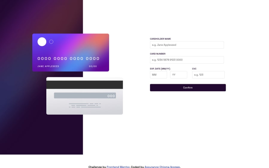
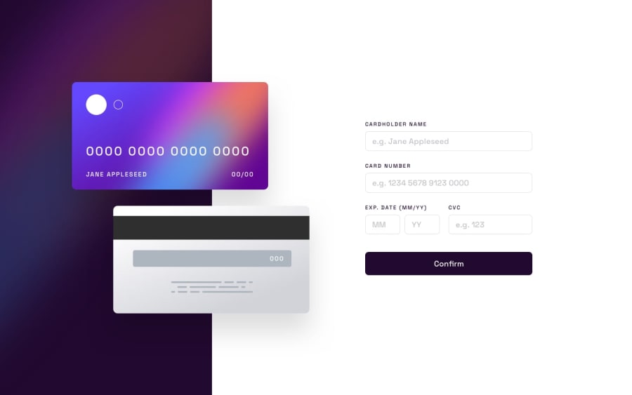
Design comparison
Solution retrospective
This is actually my first frontend mentor challenge, 😅I wanted to really challenge myself, so I picked a junior one, well, thankfully I'm done with it, I've updated my solutions, based on the comments made on it... Feedback welcome 😁😁
Community feedback
- @elaineleungPosted over 2 years ago
Hi Assurance, this was a good attempt I think! Right now there seems to be some positioning and sizing issues when I'm resizing the browser. The mobile view looks somewhat OK, but the desktop view isn't quite optimal. What I'd try is to give the container firstly a
height: 100vhso that no white space would be seen at the bottom. I can't figure out what's going on in the left size and also the form at around the 800px breakpoint. I might make the cards a bit smaller, and also reduce whatever padding, margin, or gap you have beside the form. Anyway, positioning elements is never easy, but keep trying and keep experimenting!Marked as helpful0@Aik-202Posted over 2 years ago@elaineleung okay I'll do just that, thank you very much 😊😊
0
Please log in to post a comment
Log in with GitHubJoin our Discord community
Join thousands of Frontend Mentor community members taking the challenges, sharing resources, helping each other, and chatting about all things front-end!
Join our Discord
