Design comparison
SolutionDesign
Solution retrospective
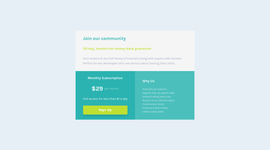
I am trying out using React together with CSS grid and styled component. Any feedback is appreciated!
Community feedback
- @AdrianX19Posted over 2 years ago
Hi @bigmac369!
Congrats on submitting the challenge! A few minor things I've noticed:
- the accessibility issues you have can be solved by changing the #root 'div' to a 'main' tag
- background colour of the join community section is a bit off comparing to the design, it should be white
- monthly subscription text should be aligned to left, to achieve that you should probably set 'align-items' property to 'flex-start' for this section
- the 'monthly subscription' and 'why us' cards should be aligned, I believe you could achieve that by changing justify-content for those cards to 'space-between' and them add the same top and bottom padding for both of them
Keep it up! :)
Marked as helpful1
Please log in to post a comment
Log in with GitHubJoin our Discord community
Join thousands of Frontend Mentor community members taking the challenges, sharing resources, helping each other, and chatting about all things front-end!
Join our Discord
