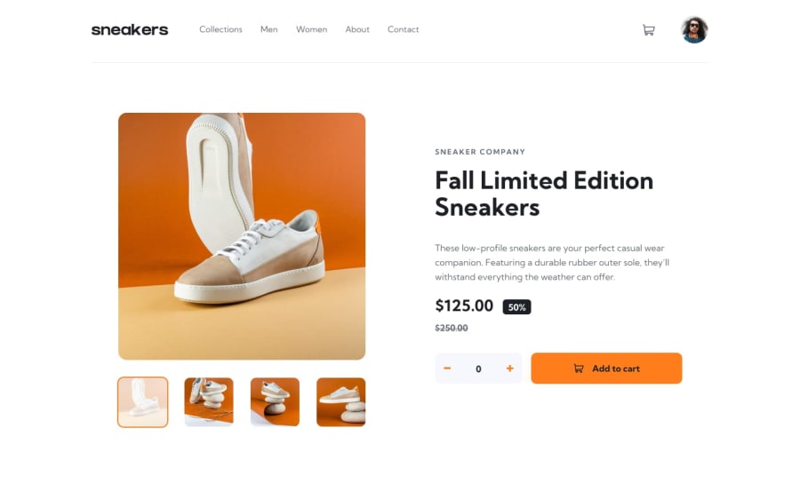
CSS Grid, React, components Responsive, react-routing
Design comparison
Solution retrospective
Please, don't hesitate to give some feedbacks so that I could improve the project and work with that
Community feedback
- @sulemaan7070Posted over 1 year ago
hey Azizbek Yunusaliev😄, you did a great job. here are a few tips to improve...
1.when the items are added to the cart the users have no idea that items are added successfully... you can place a
spanpositioned absolutely to the cart svg.. which indicates items added successfully to the cart.2.When I open the mobile-menu and start scrolling down the
closesvg is going to top .. you can stop that scrolling behavior by adding this JS codethis stops the user from scrolling: (document.body.style.overflow = "hidden")This will help in scrolling again(default) : (document.body.style.overflow = "auto");3.I also recommend to you increase the height and width of
.cart-dropdown-containera little bit more...Everything else looks great !! happy coding💯👍🏻✅
Marked as helpful1 - @AhmadYousif89Posted over 1 year ago
Hey Azizbek 👋
Your solution looks Awesome 👍I just have a couple of notes that I hope it would be good for your project :
-
the animation is a bit too much may be readjusting the duration and the starting point would help (nit-picking I know 😅)
-
the animation on the header navigation tho is totally unnecessary (IMO) and doesn't make a lot of sense either 😐
-
the cart modal need to be a bit wider and taller to accommodate the items in it (I guess that you have added a fixed width and height on it 🤔)
-
the logic for adding the product to the cart doesn't make a lot of sense, instead of adding the same product twice or more you should just increase the quantity of that particular product, so if it doesn't exist initially in the cart you just push it to the cart with qty of 1, but if it's already in the cart you increase the qty by 1 or 2 or whatever the counter is at this point.
-
the lightbox animation looks good, but what I don't like is that the backdrop is being animated with it I think you placing them in the same component, try separating the lightbox/carousel from the backdrop and just animate the lightbox and maybe add a bit of delay so that the backdrop come first then the lightbox after like 200ms
-
I really loved the Authentication form section ❤
I haven't really looked at the code so I can't give you my 2cents on it tho, but anyway I hope you find my notes helpful for you.
Keep Coding 👊
Marked as helpful0 -
Please log in to post a comment
Log in with GitHubJoin our Discord community
Join thousands of Frontend Mentor community members taking the challenges, sharing resources, helping each other, and chatting about all things front-end!
Join our Discord
