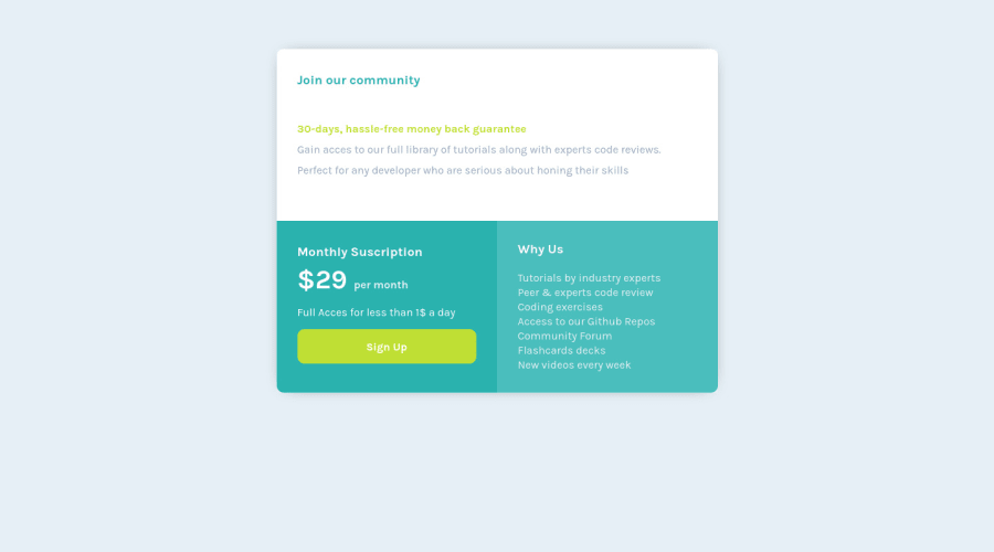
Design comparison
Solution retrospective
Any Feedback is apreciated
Community feedback
- @vanzasetiaPosted almost 3 years ago
Greetings, Gerardo! 👋
Good effort on this challenge! 👍
I recommend changing the title of the site to a better title. I know that it's not a big deal, especially since this is for learning purposes but, why not? 😅
I would not recommend changing the
htmlor root font size because it can cause huge accessibility implications for those of the users with different font size or zoom requirements. Read what an accessibility expert (Grace Snow) has said about it.I suggest setting
max-widthinstead of keeping changing thewidthfor each breakpoint. This way, not only does it prevent the card from becoming too large on a widescreen but also allows the card to shrink if needed.Hope you find this useful!
0
Please log in to post a comment
Log in with GitHubJoin our Discord community
Join thousands of Frontend Mentor community members taking the challenges, sharing resources, helping each other, and chatting about all things front-end!
Join our Discord
