Design comparison
Solution retrospective
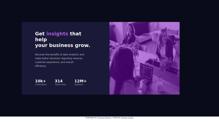
I used very basic elements and css properties to make this. Please help me out by letting me know the advanced elements and attributes that I might use to improve both the code and the look of the website. I have only built the desktop version as I do not know how to write the code for the mobile view. If you can guide me to any resource, would be thankful.
Community feedback
- @FMcodingPosted over 3 years ago
Hey Prannay!
The website looks great! Next time you can try using flexbox (justify-content: space-between) for spacing content out evenly. https://www.w3schools.com/cssref/css3_pr_justify-content.asp
As for the mobile view, you want to use media query, which changes css properties depending on the user's device. https://www.w3schools.com/cssref/css3_pr_mediaquery.asp
There's also a border-radius around the content, so watch out for those next time. Happy coding!
Marked as helpful1@prkedia81Posted over 3 years ago@ForTestingStuffs Hey Tony! Thanks for your valuable inputs. I’ll look into flexbox and media query, and incorporate those in my next challenge. I had completed missed the border-radius section. Seems like I have to pay some more attention to the details!
0
Please log in to post a comment
Log in with GitHubJoin our Discord community
Join thousands of Frontend Mentor community members taking the challenges, sharing resources, helping each other, and chatting about all things front-end!
Join our Discord
