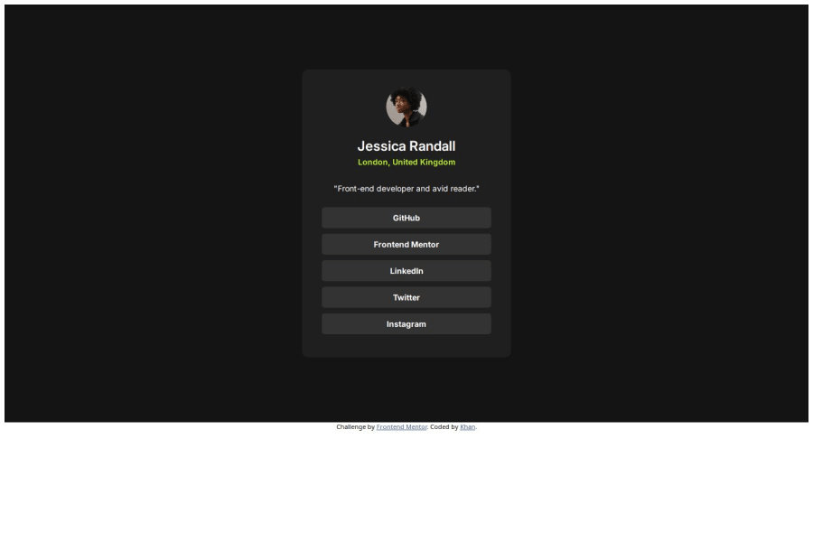
CSS Grid model with centered content and uordered list
Design comparison
Community feedback
- @tttam0113Posted about 2 months ago
- I understand that you only implemented the CSS based on the image, but you should try to use parameters that match the design as closely as possible.
- You have only designed based on the desktop version, so you should update the page to make it responsive for mobile mode as well.
- When hovering over the "li" tags, you should also change the text color.
0@khanwelcomesPosted about 2 months ago@tttam0113 Thanks for the feedback. could you help me how to get the exact parameters?
0@tttam0113Posted about 2 months ago@khanwelcomes The best way is to unlock the PRO version, so you can download the design files, like Sketch or Figma. This way, you can get the exact sizes, spacing, and everything else you need.
The free option is to use any ruler tool to measure the spacing, sizes, etc., from the image you are provided with, but remember to set the scale ratio to 100%.
You can also use an online tool like Photopea (photopea.com) - an online version of Photoshop. Open the image and use the ruler tool there to measure distances.
Marked as helpful0
Please log in to post a comment
Log in with GitHubJoin our Discord community
Join thousands of Frontend Mentor community members taking the challenges, sharing resources, helping each other, and chatting about all things front-end!
Join our Discord
