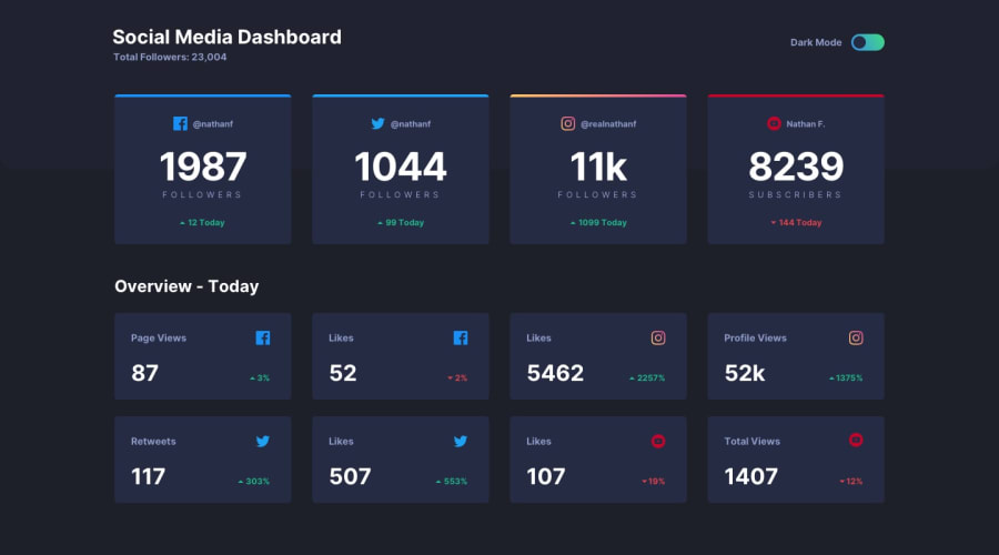
Design comparison
Solution retrospective
Any feedback is welcome to improve my coding ability.
Community feedback
- @artimysPosted almost 4 years ago
Really great job Rafet, mobille first and responds great, got the instagram gradient border effect working too. The detail in the cards look on point. I'll add some suggestions below.
-
you have a good structure to your HTML mark. To bring it to the next level look into html semantics if you haven't already. learn more here. It can give meaning to your containers. For this challenge look up
mainandarticletags -
The dark theme background does not take up the entire page because it's in the main container. Try the body for most background colors/images:
body {
    background-color: var(--color-bg);
    min-height: 100vh;  // might not be needed for bg color but useful for background images for future reference
}
Toggle button: Fully functional 👍. My advice when creating custom elements. Consider assistive technologies like screenreaders. Since this is fully custom look into:
ariaattributes to help giving your control meaning and help out assistive tech- hover styles to help visually something
- see if you can use the
tabkey on your keyboard to focus and activate with theenterkey
Overall again great job. Keep on coding!! 👍👍
2@rafetbasturkPosted almost 4 years ago@artimys Thanks for your feedback Arturo. It is really so descriptive.
I know about the HTML semantics but I got accustommed to using div mostly because online courses mostly teaches that way. But from now on I will try to use them instead.
I have changed my toggle div into a button element so tab and enter works :)
0 -
- @ApplePieGiraffePosted almost 4 years ago
Hey, good job, rafet! 👋
Your solution looks good and the light/dark themes work well! 👍
One more tiny thing in addition to artimys' great feedback—there's a horizontal scroll bar that appears along the bottom of the page in the desktop and mobile layouts. Adding
overflow-x: hiddento thebodyshould easily get rid of this problem. 😉Keep coding (and happy coding, too)! 😁
1@rafetbasturkPosted almost 4 years ago@ApplePieGiraffe Hello there! Scroll bar doesn't appear in my mobile, tablet and laptop. Why does it appear in your computer? How should I test it whether or not it appears on other browsers/devices? I'll add it anyway. Thanks for your feedback.
0@ApplePieGiraffePosted almost 4 years ago@rafetbasturk
Hmm... that's odd! I wish I could take a screenshot to show you, but images aren't supported yet in comments. The scroll bar isn't so evident in the responsive developer tools... but it does show up in my browser window for some reason. IDK, nice job, anyway!
0
Please log in to post a comment
Log in with GitHubJoin our Discord community
Join thousands of Frontend Mentor community members taking the challenges, sharing resources, helping each other, and chatting about all things front-end!
Join our Discord

