

Design comparison

Solution retrospective
played around with grid areas to make this more responsive, also updated the link to this github repo
Community feedback
- @correlucasPosted over 2 years ago
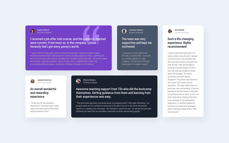
👾Hello Enochlee, congratulations for your solution!
Your solution seems really good, its almost pixel perfect. The only problem you've with this its because the container isn't responsive and so when the screen starts to scale down the container elements doesn't contract.
To fix this behavior, you should swap
widthformax-widthinside the class.card:.card { max-width: 20.56rem; height: auto; }There's also another detail, is not every profile photo that have the border around the picture, is only the purple and the black card.
Hope it helps to improve your solution, happy coding!
1

Please log in to post a comment
Log in with GitHubJoin our Discord community
Join thousands of Frontend Mentor community members taking the challenges, sharing resources, helping each other, and chatting about all things front-end!
Join our Discord