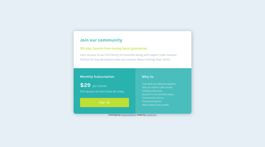
Design comparison
SolutionDesign
Solution retrospective
Hi, this is my solution, feedbacks are very welcome!! =D
Community feedback
- Account deleted
Good job on completing the challenge.
At 600px the card gets bigger than the screen, and I think it is because you have set it to a fixed width, and not actually allowing it to resize based on the viewport, which makes you lose the responsiveness as certain screens won't be able to show the whole thing.
I suggest you use percentages(%), or viewport units so it can resize based on the screen, or you could adjust the media query to something a bit bigger.
Keep coding👍.
1
Please log in to post a comment
Log in with GitHubJoin our Discord community
Join thousands of Frontend Mentor community members taking the challenges, sharing resources, helping each other, and chatting about all things front-end!
Join our Discord
