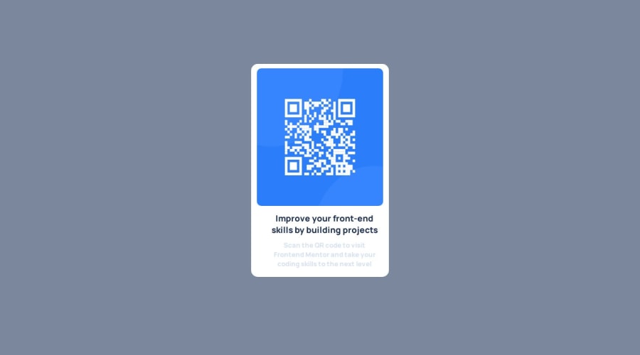
Design comparison
Community feedback
- @taylor003Posted over 1 year ago
thank you very much for the corrections. i have just made the code as you said and it now looks better than at 1st. thanks...
0 - @jonatasolmartinsPosted over 1 year ago
Congratulation for the good work!
I have a few tips to help you with your skills.
Change your HTML to be more semantic, and use the main tag instead a div to specify your main content.
<body>
  <main>
    <div class="container">
      <img src="image-qr-code.png" alt="qrcode" class="qr">
      <div class="bottom">
        <h1></h1>
        <p></p>
      </div>
  </div>
  </main>
</body>
You used margin to centralize your card but this is bad because your card will start to move when the viewport shrinks or grow. To fix that, move your display flex to the body tag so you can centralize your card and it will be consistent in any viewport.
body {
    display: flex;
    flex-direction: row;
    justify-content: center;
    align-items: center;
    min-height: 100vh;
    background-color: var(--Grayish-blue);
}
This is how the container class(I rename the main class to the container in this example) looks like without the margins you were using to centralize your elements.
.container {
    width: 310px;
    background-color: var(--White);
    border-radius: 15px;
    text-align: center;
    padding: 10px;
}

.container img {
    height: 310px;
    width: 284px;
    border-radius: 10px;
}
To align your h1 and p tag on the .bottom class you can use the padding-inline property to add a horizontal space around it, and add a padding-block to add a space on the top and bottom of it. You can remove the margins and the width from it as well.
.bottom {
    padding-inline: 1.5rem;
    padding-block: 0.7rem;
}
0
Please log in to post a comment
Log in with GitHubJoin our Discord community
Join thousands of Frontend Mentor community members taking the challenges, sharing resources, helping each other, and chatting about all things front-end!
Join our Discord
