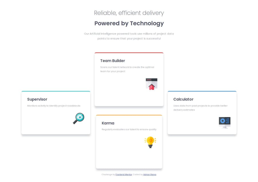
CSS Grid for Tablets and Vertical Margins to Center it in its Cells
Design comparison
Solution retrospective
I'm proud of practicing CSS Grid and discovering a way to center an element within its assigned grid area without adding more elements, just using vertical margins.
What challenges did you encounter, and how did you overcome them?vertical alignment of an element inside a grid area, it just requires vertical margins.
What specific areas of your project would you like help with?well it does not look exactly like the example in some desktop widths, maybe is fine that way, I don´t know
Community feedback
- @mkostrikovPosted 8 months ago
you can learn more about the structure of the document here: https://web.dev/learn/html/headings-and-sections
0@adrian-reina-391Posted 8 months ago@mkostrikov but what should I have done differently, I understand sections, header, and divs, I rather use DIVs, but I have been sugested not to use them
0
Please log in to post a comment
Log in with GitHubJoin our Discord community
Join thousands of Frontend Mentor community members taking the challenges, sharing resources, helping each other, and chatting about all things front-end!
Join our Discord
