Not Found
Not Found
Not Found
Not Found
Not Found
Not Found
Not Found
Not Found
Not Found
Not Found
Not Found
Not Found
Not Found
Not Found
Not Found
Not Found
Not Found
Not Found
Not Found
Not Found

Submitted

CSS grid for socialLinkProfile, flexbox for responsive flexibility.

@Jesuis-Jacques

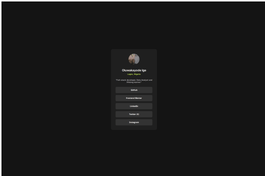
Desktop design screenshot for the Social links profile coding challenge

This is a solution for...

  • HTML
  • CSS
1newbie
View challenge

Design comparison


SolutionDesign

Solution retrospective


What challenges did you encounter, and how did you overcome them?

I faced an issue where the items in my card div were not properly centered even though I switched between using place-items and justify-content with align-items. I was able to solve this issue using text-align.

What specific areas of your project would you like help with?

Understanding how to use Figma.

Community feedback

Wendy 1,890

@wendyhamel

Posted

Hi Oluwakayode Ige,

It is great to see you testing your skills on this challenge.

If you want to learn to work with figma, there are examples if you setup an account and there are many tutorials you can try. There are paid tutorials, but a lot of vry usefull free ones too, on youtube for example.

I found some things you may want to consider to improve your solution.

  • I noticed you wrapped the buttons with the <a>-tag. It would suffice to use the <a>-tag without the <button> inside. Either use a button, (mostly for submitting forms or opening modals) or an <a> tag (for linking to pages within your site or other websites) Combining them makes it less accessible and can couse unwanted issues. To learn more about this, you could read about buttons and <a>-tags in the MDN docs.

  • Next I noticed that the hover state of the links is missing. You might want to add this. It is a great way for users to see that there are elements on your page to interact with.

  • The last thing I want to point out are the scroll bars. You set your <main> area to

height: '100vh' 
width: '100vw'

This pushes your footer outside the screen. Consider moving some styling from <main> to the <body> and maybe take a look at flex and grid to place the content on the page the way you need it to. It takes a bit of tinkering to figure out what you specifically need, but it is worth learning, so you can put it to use in future projects.

The

are great places to read about it.

Happy coding!

0

Please log in to post a comment

Log in with GitHub
Discord logo

Join our Discord community

Join thousands of Frontend Mentor community members taking the challenges, sharing resources, helping each other, and chatting about all things front-end!

Join our Discord