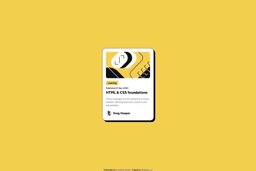
CSS Grid for responsive page, Flexbox to add text & img in single line
Design comparison
Solution retrospective
Hi everyone!
I hope you're doing well. π I've just completed this challenge and would love to get your valuable feedback. Your insights will be incredibly helpful for my learning journey. Below are a few questions I have:
1οΈβ£ How does the project perform on different devices? Any recommendations for better responsiveness?
2οΈβ£ How is the organization of my code? Any suggestions for improving code readability or maintainability?
3οΈβ£ What are your general impressions of the project? Are there any standout positives or areas that need improvement?
Thanks a lot πfor taking the time to review! I truly appreciate your feedback and look forward to learning from your perspectives. Feel free to drop your comments or suggestions below.
Community feedback
- @BlackpachamamePosted 11 months ago
- I recommend doing a small reset to the styles that come by default in the browsers. To do this, you can apply a couple of properties to the universal selector
*
, with this you will make your site look the same in all browsers:
* { margin: 0; box-sizing: border-box; }
- You can apply
display: block
to the image to remove the white space generated underneath - I leave you the task of researching the
reset CSS
and thebox-sizing: border-box
- If you want to center the content in the center of the screen and keep the footer below it, you can apply these changes to your
body
:
body { font-family: "figtree"; background: hsl(47, 88%, 63%); display: grid; grid-template-columns: repeat(16, 1fr); grid-template-rows: 1fr auto; /* new */ min-height: 100vh; /* new */ }
To improve semantics, you can change the following:
<div class="card">
por<main class="card">
<div class="attribution">
por<footer class="attribution">
Marked as helpful1@shubham-cjPosted 11 months ago@Blackpachamame
Hey! Marcos
Thank you for your feedback it was really helpful. I have made the code changes that you told me π
Can you please help me again, in feedback you said that π You can apply
display: block
to the image to remove the white space generated underneathBut I can't get it, can you explain this again where should I use
display: block
property and where does white space appear?1@BlackpachamamePosted 11 months ago@shubham-cj Oh! An apology haha is that that space cannot really be seen with the naked eye in this case. I think this video will make it clearer to you: Get rid of that small space under your images
Although in this case it is practically not noticeable, it is not necessary for you to apply it. But keep it in mind because you will probably need it at some point.
Marked as helpful1@shubham-cjPosted 11 months ago@Blackpachamame
Oh! This is insightful I had no idea about it, but Now I understand your point. I'll use this in the upcoming projects. Thank you!!π€
0 - I recommend doing a small reset to the styles that come by default in the browsers. To do this, you can apply a couple of properties to the universal selector
- @danielmrz-devPosted 11 months ago
Hello @shubham-cj!
Your solution looks great!
I have a suggestion for improvement:
- In order to make your HTML code more semantic, and since that is the main title of the screen, you can replace the
<a>
with<h1>
. Unlike what most people think, it's not just about the size and weight of the text.
The
<h1>
to<h6>
tags are used to define HTML headings.<h1>
defines the most important heading.<h6>
defines the least important heading. Only use one<h1>
per page - this should represent the main heading/subject for the whole page. Also, do not skip heading levels - start with<h1>
, then use<h2>
, and so on.This tag change may have little or no visual impact but they make your HTML code more semantic and improve SEO optimization as well as the accessibility of your project.
I hope it helps!
Other than that, great job!
0 - In order to make your HTML code more semantic, and since that is the main title of the screen, you can replace the
Please log in to post a comment
Log in with GitHubJoin our Discord community
Join thousands of Frontend Mentor community members taking the challenges, sharing resources, helping each other, and chatting about all things front-end!
Join our Discord