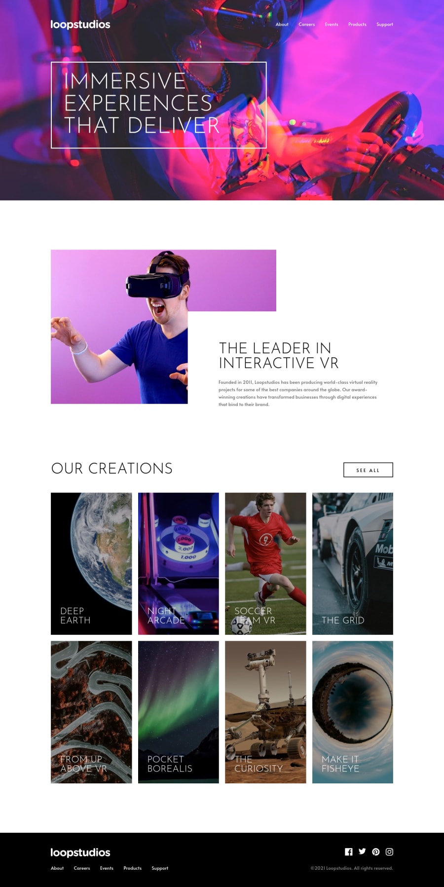
Design comparison
SolutionDesign
Solution retrospective
- This is the first landing page I did on my own so I struggled a lot. My code is a big mess, I tried to change font-size, change padding and margin so that the page does not break then I ended up having too many break-points. Also, I've never done a hamburger menu before, I don't know if my solution is okay or is there an easier way? I'm so tired that I just want to finish this so bad that I don't pay much attention to accessibility.
- Is there something you would you like to change in my solution? Thanks for your feedback in advance.
Community feedback
Please log in to post a comment
Log in with GitHubJoin our Discord community
Join thousands of Frontend Mentor community members taking the challenges, sharing resources, helping each other, and chatting about all things front-end!
Join our Discord
