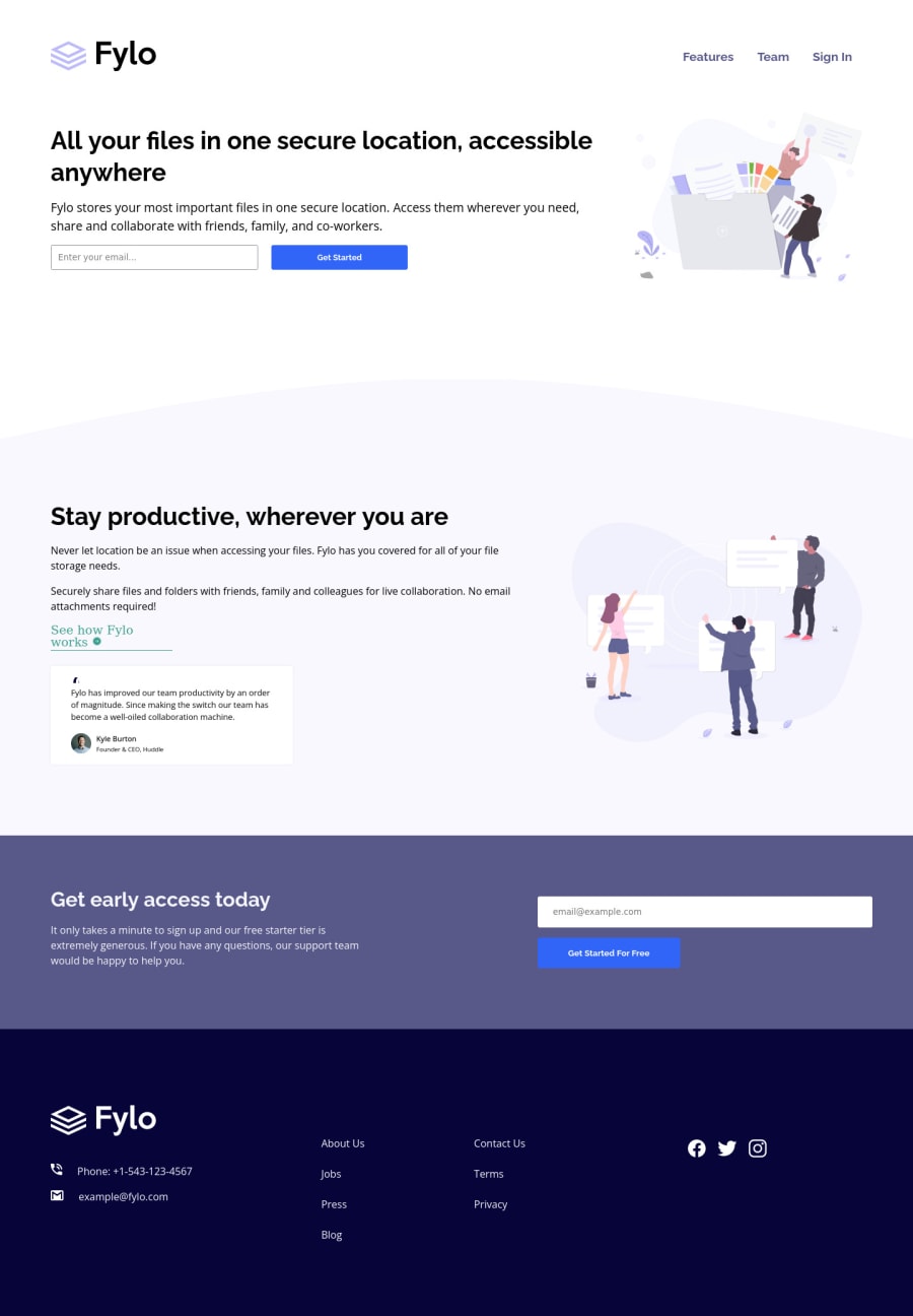
Design comparison
Solution retrospective
Took my time to finish this challenge, as I had not been using SCSS in a long time and had to get accostumed to it again.
Most important error I commited: planned the entire project from the beginning, except for the js form validation error message, which is now not positioned properly on all possible screen sizes. Takeaway: ALWAYS plan the entire project from the beginning, leave nothing out. This will save you a lot of time!
All feedback is much appreciated :)
Happy Coding!
Community feedback
- @PhoenixDev22Posted over 2 years ago
Hello Patrick,
Congratulation on completing this challenge. Excellent work! I have few suggestions regarding your solution, if you don't mind:
HTML
- The logo's alternate text should not be
logo
. You can use the website's name as an alternate text. You may setalt=”Fylo
. If you are going to leave the logo not wrapped by<a>
, it’s better to place it out the<nav>
as it does not navigate the user in anywhere(only an image).
- look up a bit more about how and when to write alternate text on images. Learn the differences between decorative/meaningless images vs important content like
icon-phone, icon-arrow , icon-quotes
andicon-email
.... For decorative images, you set an emptyalt
to it with anaria-hidden=”true”
to remove that element from the accessibility tree. This can improve the experience for assistive technology users by hiding purely decorative images.
- Forms with proper inputs and labels are much easier for people to use. To pair the label and input, one way is an explicit label’s
for
attribute value must match its input’sid
value. Input fields without accompanying labels can lead to accessibility issues for those who rely on screen readers. If a screen reader comes across an input field without a label it will try to find some accompanying text to use as the label. (To hide the label visually but present for assistive technology, you may usesr-only
class ).
- Profile images like that avatar are valuable content images, not decorative .For the alternate text of the avatar testimonial should not be ** empty**. You can use the avatar’s name
alt=" kyle burton"
.
class="cta-section" and class="cta-form"
should live in the main landmark.
- For
class="footer-grid__contact"
, you may use like<address> ...
tag to wrap the contact information for the author/owner of a document or an article (email and phone number). By adding semantic tags to your document, you provide additional information about the document, which aids in communication.
- As you have use the
<nav >
landmark to wrap the footer navigation , you shouldaria-label=”secondary “
oraria-label=”footer”
to it. A brief description of the purpose of the navigation, omitting the term "navigation", as the screen reader will read both the role and the contents of the label. Thenav
element in the header could use anaria-label="primary"
oraria-label=”main”
attribute on it. The reason for this is that, you should add thearia-label
for a nav element if you are using the nav more than once on the page.you can read more in MDN
- Instead of using a generic div to wrap the social links
class="footer-social"
, you put your links within an unordered list structure so that a screen reader will read out how many things are in the list to give visually impaired users the most information possible about the contents of the navigation.
- Links must have discernible text. The social links wrapping the icons must have
aria-label
orsr-only
text indicate where the link will take the user. Your icons are purely decorative, you'll need to manually add an aria-hidden attribute to each of your icons.
Aside these, you did great work. Hopefully this feedback helps.
Marked as helpful1 - The logo's alternate text should not be
- @PPechmannPosted over 2 years ago
Hey Phoenix,
thank you for taking the time on leaving a constructive feedback :)
I am glad you pointed the corrections out, as I tend to focus only on design and completely forget screen readers and proper html usage. In this challenge I was so focused on re-learning scss, that I completely skipped it.
Now I have something to focus on for my next challenge :)
Thank you again and have a great weekend!
0
Please log in to post a comment
Log in with GitHubJoin our Discord community
Join thousands of Frontend Mentor community members taking the challenges, sharing resources, helping each other, and chatting about all things front-end!
Join our Discord