Design comparison
Community feedback
- @MarlonPassos-gitPosted about 3 years ago
hi John, nice solution.
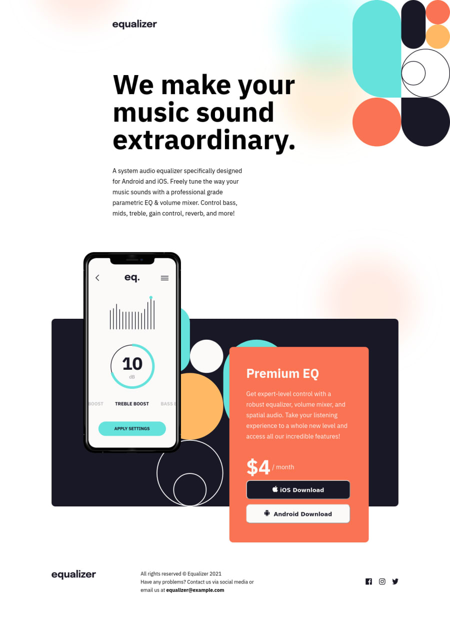
I really liked the way you used to style the hover color of the social icons. What was your strategy to get to that role and the color is the same as the designer?
1@thunderhead27Posted about 3 years ago@MarlonPassos-git
Hey, thanks for the compliment. I still to make a few tweaks on the layout - I kinda messed up the position of the header.
To change the color of the social media icons, I used the "filter" property on the :hover pseudo class. Initially, I tried to use "fill", but it didn't work.
To use filter, you have to specify the color in a different format. Hex and rgba codes don't work here. For example, if you want to change the color of an icon on hover to black, then you would write something like
icon::hover { filter: invert(0%) sepia(100%) saturate(7439%) hue-rotate(219deg) brightness(105%) contrast(112%); }
Use this link to convert the hex code of a color to the format specified above:
https://codepen.io/sosuke/pen/Pjoqqp
2@Anubliss-0Posted about 3 years ago@thunderhead27
Ah! Glad to see I'm not the only one who used this solution.
Setting a div background is a really useful way to place an image exactly how you want it. So its a shame changing the color of an SVG is such hard work!
1
Please log in to post a comment
Log in with GitHubJoin our Discord community
Join thousands of Frontend Mentor community members taking the challenges, sharing resources, helping each other, and chatting about all things front-end!
Join our Discord
