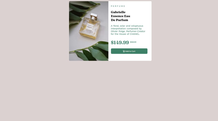
Design comparison
Solution retrospective
Hello, please what's the better way of setting up this project, useful tips to help me improve. Thanks a lot !
Community feedback
- @faha1999Posted over 2 years ago
Hello, Ikenna Oguejiofor Congratulations on finishing this project. It's lovely and great on the whole! Just a little tip:
- You might want to use semantic tags like the
<main>to wrap your code, instead ofdiv. like
<main class="container"> </main>- add
alt="image-product-desktop"attribute inimg
This would help improve accessibility.
- add the below styles to the
body. It will center everything
body { justify-content: center; align-items: center; display: flex; min-height: 100vh; flex-direction: column; }- remove the below styles from
.container&.wrapper
.container{ /* width: 50vw; */ /* display: flex; */ } .wrapper{ /*left: 50%;*/ background: white; } @media (max-width: 550px) .wrapper { /*margin-top: 20px; */ /* margin-left: 20px; */ /*left: 50%;*/ } .product-details { width: fit-content; } }-
Fixed the other HTML Validation error from the report.
-
Instead of using
px, use relative units likerem or emto get better performance when the information on your page needs to be resized for multiple screens and devices.REMandEMapply to all sizes, not justfont-size. You can code your entire page inpxand then, at the very end, use the VsCode pluginpx to remto perform the automatic conversion px to rem
I hope it will work. Happy coding.
Marked as helpful0 - You might want to use semantic tags like the
- @ikennarichardPosted over 2 years ago
Thank you Faha for the comments and awesome tips, ill get it done.
0
Please log in to post a comment
Log in with GitHubJoin our Discord community
Join thousands of Frontend Mentor community members taking the challenges, sharing resources, helping each other, and chatting about all things front-end!
Join our Discord
