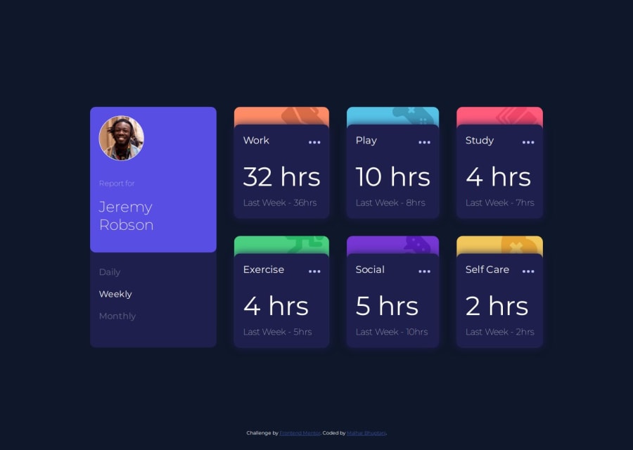
Design comparison
Solution retrospective
Modularizing the UI small components made the rest of the part very smooth. Also, use of css grid, media query and styling SVGs was some of my weak areas so I am glad I could practice with this.
The readme template was awesome, if provided like this I would defiantly put read me for all my projects.
I have worked more on web-apps then mobile-apps so mobile-first UI doesn't come naturally to me.
What challenges did you encounter, and how did you overcome them?I couldn't place the background SVGs dynamically as each one needed different positions so checked some submitted gits and took reference of their styling.
What specific areas of your project would you like help with?CSS - I think for this small app I have so much classes if I can get some refacotring advice on them then it would be nice.
Mobile-First: Is it really needed? Why? What are the drawbacks if I don't follow it really.
Community feedback
- @SaviourjrPosted 6 months ago
Nice work man it looks perfect!!
Try setting the main container div Min-height to a 100vh, justifying-content at center, Align at center, if it's not perfectly at center you can use padding top
if this was helpful. Mark it as helpful. i will come around and any questions feel free. Happy Coding Man
Marked as helpful2 - @lukeSchwadePosted 6 months ago
Looks great! So, to answer your question about Mobile-first, it's mainly because
-
a majority of web traffic is mobile (over 55%, more or less depending on the kind of website) so it stands to reason that you want to think about your biggest demographic first. This is reason enough in a professional environment, but also
-
Web designs are straightforward compared to mobile. Open any website, and notice that all the content is (usually) single-column centred with whitespace on both sides, which is easier for the eyes to track; you don't have all that wiggle room when everything has to fit snugly (but not too snugly) on a 425px wide mobile screen. It makes sense to tackle the more complicated problem first, then just add breakpoints for the easier problem.
Think of it like this: your job is to squeeze 30 boxes of stuff into 1) a warehouse, and 2) a storage closet. The first problem is trivial, so you should start by solving the real challenge, which gets you thinking about what parts are essential (eg. do we really need this widget for the small version?)
Marked as helpful1 -
Please log in to post a comment
Log in with GitHubJoin our Discord community
Join thousands of Frontend Mentor community members taking the challenges, sharing resources, helping each other, and chatting about all things front-end!
Join our Discord