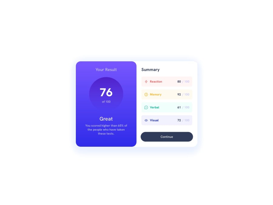
CSS Grid, Flexbox, Mobile-first workflow
Design comparison
Solution retrospective
I don't have an specific question about my project. So, I rather like to ask you for any advice you can give me and ask this: Do I have to put the Frontend Mentor logo in my projects?
Thanks
Community feedback
- @SutonTochPosted over 1 year ago
This solution looks excellent!
You can absolutely see the amount of care that went into this, good job!
To your question: I don't think that you have to use then 'Frontend Mentor'-Logo for your projects. Never read anything about that, anyway. I mostly do because of convenience, but might change that in the future.
Some general advice:
- Use more CSS-Variables. While your design looks absolutely excellent, there are many absolute values and tiny tweaks you made. This makes maintenance very time-consuming. Having CSS-Variables for border-radius, font-size, color and spacing could reduce the necessary time + your design looks more consistent. Sometimes designers get lost in detail, but that doesn't always mean we as Frontend-Devs have to.
Nitpicking:
- You could have used your custom-variable
--gradientefor the background in.boxtoo - Use more shorthands for margin and padding, e.g. in
.element:padding-left: 15px; padding-right: 15px→padding: 0 15px;. This is one line less and makes everything a little bit more readable. - There is some unnecessary code like:
.summaryScreen {padding: 1px;}. No human would notice that. - Some inconsistencies with color, where sometimes you use
color: hsl(0,0%,100%);and sometimescolor: white; - In your .score-classes, you used an HTML-Tag
<spam>, but I'm pretty sure you wanted to use<span>. But I would leave it because it's a funny typo xD. - For HTML-Semantics, you could have used <main> and <section> Tags to improve readability and SEO-ranking.
I've never seen the
@media (hover: hover) {...}before. Very interesting! Your comment states that: "this code changes the color of the button when the cursor passes over it". For that, you don't need the media-query..continue:hover {...}would have been enough. According to (https://dev.to/jackdomleo7/media-hover-hover-css-media-query-5bge) you can use this media-query to create specific styles for devices that can hover → hover-specific-styles so to speak. But I've never used it before.Congrats on completing the challenge!
This wasn't an easy "Newbie"-Challenge. Be proud of your attention to detail, very impressive!
Marked as helpful1@ZotolokPosted over 1 year ago@SutonToch Bro, I've never seen someone explaining a newbie the way you did it to me. I really appreciate your comment. Thank you for the great feedback! So, Do you think I must write that phrase of "Challenge by Frontend Mentor. Coded by ...", instead?
1@SutonTochPosted over 1 year ago@Zotolok I think as long as you mention 'Challenge by Frontend Mentor' somewhere it's fine. Either on the Live-Solution page, or in GitHub should be enough. To be honest, I don't have any authority on that, so take it with a grain of salt.
0
Please log in to post a comment
Log in with GitHubJoin our Discord community
Join thousands of Frontend Mentor community members taking the challenges, sharing resources, helping each other, and chatting about all things front-end!
Join our Discord
