CSS GRID, FLEXBOX, media queries, responsive web design
Design comparison
Solution retrospective
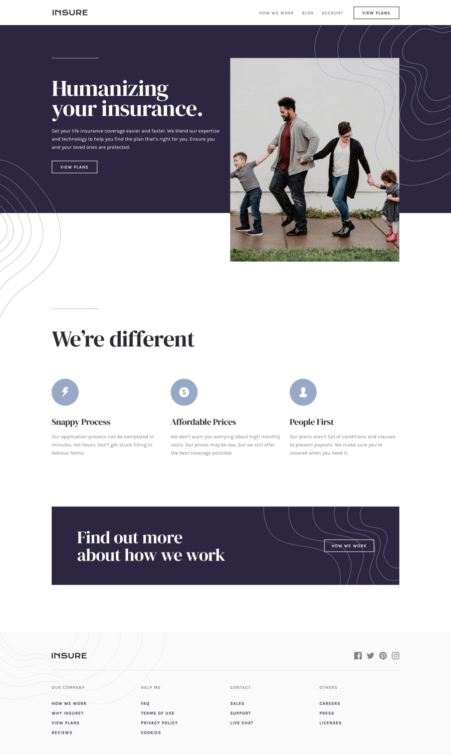
I would like to know how to maintain an image in the same place when the screen size is changed, the left pattern in the mobile version was moving when I changed the screen size, so I removed from it, but the right pattern maintained in the same place, I appreciate if anyone tell me what is the problem...
Community feedback
- @pikapikamartPosted over 3 years ago
Hey, good work on this one. The layout in desktop is good and the mobile state as well. Though there are couple of suggestions
-
Font. I think you are rendering the wrong font in here, since the original uses a sans-serif type and you are using a serif type.
-
Horizontal scrollbar. When resizing, a horizontal scrollbar appears at the bottom which we do not want. It was caused by the declaration of
width: 80.5%in yourheader sectionselector. Try to remove that and it will remove the scrollbar. Though when you use that, you need to adjust as well the sizing of the image inside it.
Regarding your query. Well the left pattern will not stay in place, because the container which is currently contained, have a scaling sizes. Meaning the container will resize so is the left background pattern. But if you made the container have a fixed size, then the pattern will stay in place.
If you need help, just ask here okay and you work is good as well^
0@macluiggyPosted over 3 years ago@pikamart Thanks a lot for your help, i aprecciate your response
0 -
Please log in to post a comment
Log in with GitHubJoin our Discord community
Join thousands of Frontend Mentor community members taking the challenges, sharing resources, helping each other, and chatting about all things front-end!
Join our Discord
