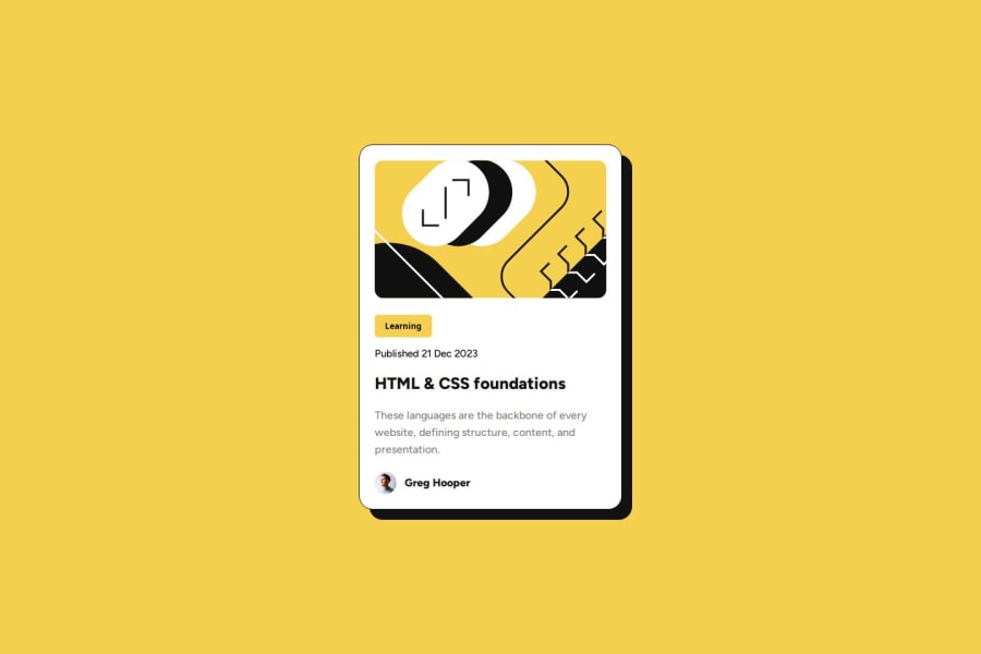
Design comparison
SolutionDesign
Solution retrospective
What are you most proud of, and what would you do differently next time?
I managed to do it without Googling. I would do more testing and try to write even better code.
What challenges did you encounter, and how did you overcome them?It was difficult to limit the font sizes and the maximum size of the desktop. I started from the font size of the mobile view.
What specific areas of your project would you like help with?It was difficult to limit the font sizes and the maximum size of the desktop.
Community feedback
- @MikoyzskiePosted 8 months ago
- Hey @jrgenweb nice work!
- If you want to get proper size of elements/components from the given design images, try using figma or photoshop then use line tool to measure padding, margin and such
- It works for me. Hope this helps!
- Happy coding!
Marked as helpful0 - @0xabdulkhaliqPosted 8 months ago
Hello there 👋. Congratulations on successfully completing the challenge! 🎉
- I have a suggestion regarding your code that I believe will be of great interest to you.
HTML 🏷️:
- This solution may cause accessibility errors due to lack of semantic markup, which causes lacking of landmark for a webpage and allows accessibility issues to screen readers, due to accessibility errors our website may not reach its intended audience, face legal consequences, and have poor search engine rankings, highlighting the importance of ensuring accessibility and avoiding errors.
- What is meant by landmark ?, They used to define major sections of your page instead of relying on generic elements like
<div>
or<span>
. They are use to provide a more precise detail of the structure of our webpage to the browser or screen readers
- For example:
- The
<main>
element should include all content directly related to the page's main idea, so there should only be one per page - The
<footer>
typically contains information about the author of the section, copyright data or links to related documents.
- The
- So resolve the issue by replacing the
<div class="card">
element with the proper semantic element<main>
in yourindex.html
file to improve accessibility and organization of your page
.
I hope you find this helpful 😄 Above all, the solution you submitted is great !
Happy coding!
0
Please log in to post a comment
Log in with GitHubJoin our Discord community
Join thousands of Frontend Mentor community members taking the challenges, sharing resources, helping each other, and chatting about all things front-end!
Join our Discord