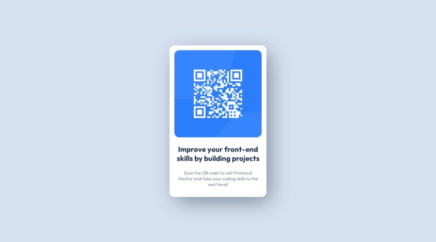
Design comparison
Solution retrospective
How exactly did you go about making sure the box shadow was as close as possible? How did you go about making sure your image was sized correctly? Did you put the image dimensions in the HTML img tag?
Community feedback
- @quielLovesLasagnaPosted about 1 year ago
Hi, Nicholas. Nice question! This was the first challenge that I took, to answer your questions:
How exactly did you go about making sure the box shadow was as close as possible?
- Using the box-shadow property, we can basically give it 5 values (x-offset, y-offset, blur, spread, and color). I checked your code and it seems you gave a value of -6px to your spread, in my case, this is unnecessary. What I did was:
box-shadow: 1rem 0 4rem rgba(0, 0, 0, 0.2);I only gave it 4 values (x-offset, y-offset, blur, and color) which worked for me. You need to experiment with this to achieve your desired outcome.
You can check this out to learn more.
How did you go about making sure your image was sized correctly?
- I did not define a fixed size for my image, what I did was I added the
max-widthproperty to my card container and made the image occupy 100% of the width:
.container {
  max-width: 30.5rem;
}

.qr-img {
  max-width: 100%;
}
Did you put the image dimensions in the HTML img tag?
- No, I prefer adding styles to my elements externally which is the proper way of adding styles.
0
Please log in to post a comment
Log in with GitHubJoin our Discord community
Join thousands of Frontend Mentor community members taking the challenges, sharing resources, helping each other, and chatting about all things front-end!
Join our Discord
