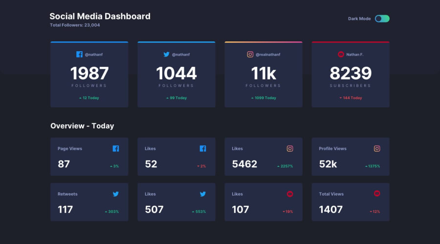
CSS GRID, FLEXBOX, ANIMATION, THEME SWITCH, RESPONSIVE
Design comparison
Solution retrospective
Hey Devs!😎
This is my first JavaScript challenge and I had so much fun tackling this challenge.
Kindly explore my JavaScript code and my overall implementation... what do you think?
Community feedback
- @grace-snowPosted over 3 years ago
Hey, Have a go at making this more accessible and screenreader friendly if you can. Eg
- use interactive, labelled elements for the toggle (checkbox / radio buttons?)
- titles and screenreader text or aria labels to explain what the text means. Eg there is no way of knowing which social media info is for, or whether followers are going up/down
Looks great viewing on my mobile though!
2@folathecoderPosted over 3 years ago@grace-snow Thanks so much. I will see to that!
1 - @mattstuddertPosted over 3 years ago
Hey Fola, you've done a great job on this challenge and have received some awesome feedback. I just wanted to reiterate what Grace mentioned, as these are particularly critical areas to work on.
Always use interactive elements (anchors, buttons, checkboxes, radios, etc.) when adding interactivity to a web page. If you don't, you make the interface inaccessible to anyone not using a mouse/trackpad to navigate.
Also, be aware of how screen readers would read out content. As Grace mentioned, anyone using a screen reader would have no idea what platform the stat was relating to or whether the number represents an increase or decrease.
On the visual side, it's looking great, though. Keep it up! 🙌
1@folathecoderPosted over 3 years ago@mattstuddert Thank you very much Matt. I really need to up my accessibility game! I will take up courses on it.
Thank you so much! 💃
1 - @ApplePieGiraffePosted over 3 years ago
Hey, Fola! 👋
This challenge is looking great and I'm liking the transition you added to the cards when switching between light/dark themes! 🤩 The rest of your solution looks good and responds very well! 👍
A few very tiny things I might suggest are,
- Adding
cursor: pointerto the cards. - Speeding up the hover effect of the cards under the "Overview" section just a bit (since they seem a little slow, at the moment).
- I think making the "light/dark mode" label clickable might be a nice idea for UX.
It's great to see how much you're learning and improving with these challenges! Keep it up! 🙌
As always—keep coding (and happy coding, too)! 😀
1@folathecoderPosted over 3 years ago@ApplePieGiraffe Thank you, APG! I am just following in your footsteps 😎. You are a great motivation and your growth should be studied closely. lol
Thanks! I will see to the fixes! 🐱🏍
1 - Adding
- @palgrammingPosted over 3 years ago
when you hover the mode selector in light mode the background of the selectors changes to the gradient but in dark mode when you hover the selector the background does not go to white. Seems like a small thing to fix
1@folathecoderPosted over 3 years ago@palgramming Thank you! I will check it out!
1@folathecoderPosted over 3 years ago@palgramming I just checked the mockup and that hover state effect was not specified. But, it would have been a cool feature for an enhanced user experience.
1@palgrammingPosted over 3 years ago@folathecoder well I guess it was just in the design files
1
Please log in to post a comment
Log in with GitHubJoin our Discord community
Join thousands of Frontend Mentor community members taking the challenges, sharing resources, helping each other, and chatting about all things front-end!
Join our Discord
