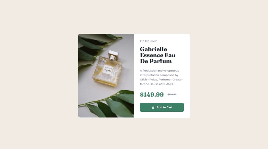
Design comparison
SolutionDesign
Solution retrospective
What challenges did you encounter, and how did you overcome them?
I did this project without a layout for figma, so there were problems with indents and dimensions.
Community feedback
- P@EddieBones1Posted 7 months ago
Nice work! I was looking at your code, and I noticed a few things:
- Include a full CSS reset which goes at the top of your style sheet, before your
body. A full css reset establishes a consistent design across different browsers by removing any default styling that each browser has.
//Full CSS Reset *, *:before, *:after { margin: 0; padding: 0; box-sizing: border-box; } body {}- You use the same media screen multiple times in your style sheet. Just use it once, and input all your code in that one media screen.
Marked as helpful0@Fender60Posted 7 months agoThank you for your feedback, it's really useful for me. Next time I'll try to do it.
0 - Include a full CSS reset which goes at the top of your style sheet, before your
Please log in to post a comment
Log in with GitHubJoin our Discord community
Join thousands of Frontend Mentor community members taking the challenges, sharing resources, helping each other, and chatting about all things front-end!
Join our Discord
