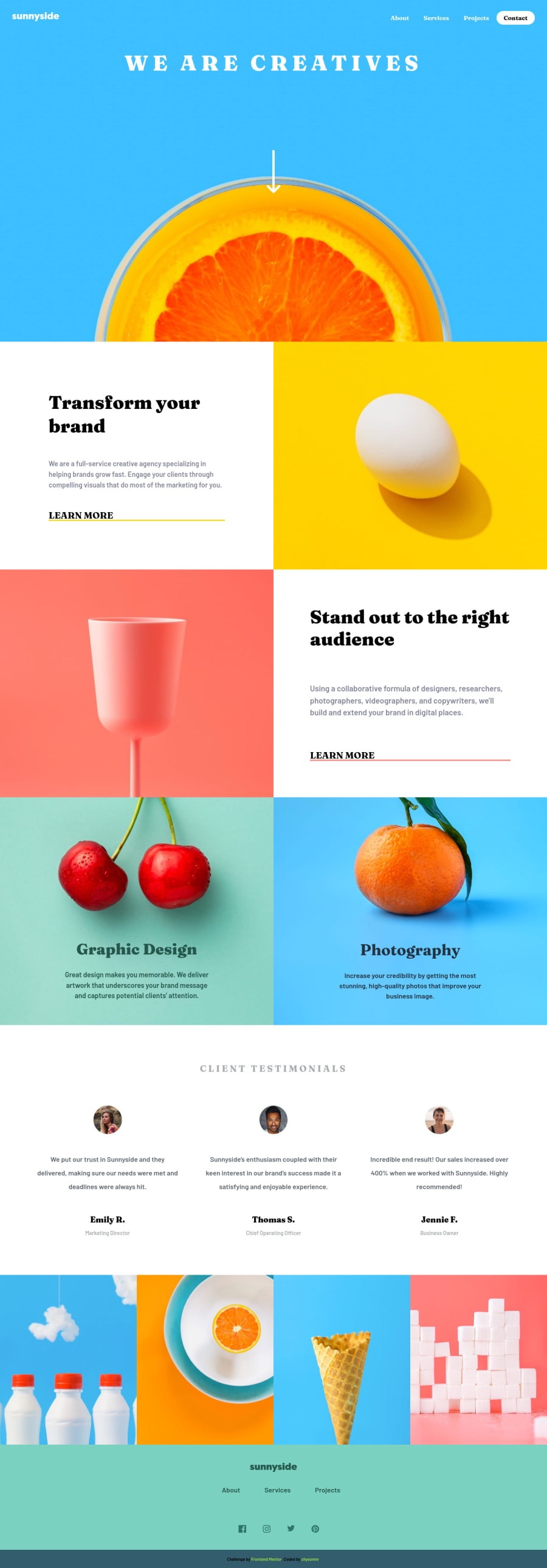
CSS GRID, FLEX, MEDIA QUERIES, JAVASCRIPT DOM MANIPULATION
Design comparison
Solution retrospective
What better practices could I use in this challenge?
Community feedback
- @victoriaodemakinPosted over 3 years ago
Nice one. please i need help on how you achieved the mobile nav menu design
0@chysomm62Posted over 3 years ago@victoriaodemakin I used position fixed for the nav ul on mobile view, then added a z-index greater than 0, then gave some margin on top and by the sides so it doesn't block other elements. For the speech pointer-like triangle, I used ::after pseudo element to position it just on top of the ul and by the right too. Not sure these are the best practices though.
0@victoriaodemakinPosted over 3 years ago@chysomm62 Thank you, I tried using position fixed but was unable to add margin to both sides. I think it's because i gave a top:0; left:0; I'll go through your code on github. Thank you again.
0
Please log in to post a comment
Log in with GitHubJoin our Discord community
Join thousands of Frontend Mentor community members taking the challenges, sharing resources, helping each other, and chatting about all things front-end!
Join our Discord