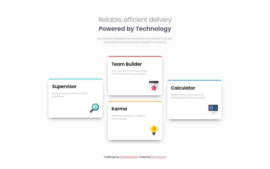
Submitted almost 3 years ago
css grid, css flexbox, mobile-first approach
@PrinceKumar931
Design comparison
SolutionDesign
Solution retrospective
I love feedback, so feel free to correct me if something is wrong!😊
Community feedback
- @BikeInManPosted almost 3 years ago
Nice work. Works well.
Was wondering why you had to use flex on individual columns again? I am guessing it is to center them vertically.
align-self:centerwould have worked without need for flex. Just a thought.Marked as helpful0@PrinceKumar931Posted almost 3 years ago@BikeInMan yeah, I thought of this after I completed it😂, thanks for pointing it out though.
0 - @SamarthMaliPosted almost 3 years ago
Many congratulations to complete this 🤗🤗
0
Please log in to post a comment
Log in with GitHubJoin our Discord community
Join thousands of Frontend Mentor community members taking the challenges, sharing resources, helping each other, and chatting about all things front-end!
Join our Discord
