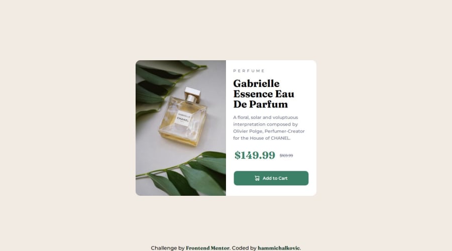
Design comparison
Solution retrospective
It's my third FM challenge solution. I'll be very glad if you give me feedback on my work.
Community feedback
- @HassiaiPosted almost 2 years ago
To center the main on the page using flexbox or grid instead of margin,
- USING FLEXBOX: add min-height:100vh; display: flex; align-items: center: justify-content: center; to the body
body{ min-height: 100vh; display: flex; align-items: center; justify-content: center; }- USING GRID: Add min-height:100vh; display: grid place-items: center to the body
body{
min-height: 100vh;
display: grid;
place-items: center;
}
Use relative units like rem or em as unit for the padding, margin, width values and preferably rem for the font-size values, instead of using px which is an absolute unit. For more on CSS units Click here
Hope am helpful.
Well done for completing this challenge. HAPPY CODING
1 - @balbir-25Posted almost 2 years ago
Can you remove the fixed position of the footer when the page is loaded footer comes on the section that does not look good as it cuts the button and image.
1@hammichalkovicPosted almost 2 years ago@balbir-25 Thank you for your feedback! I've just fixed it.
Does it look better now?
0
Please log in to post a comment
Log in with GitHubJoin our Discord community
Join thousands of Frontend Mentor community members taking the challenges, sharing resources, helping each other, and chatting about all things front-end!
Join our Discord
