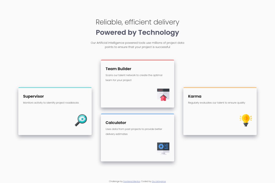
Design comparison
Solution retrospective
Here is my solution. For better responsive design I have chose to swap to single row quite early before the entire layout goes berserk but I believe there is a better way to avoid this... Any tips, criticism advice is appreciated.
I have included the changes I have been given as advice on the previous project. I believe there are more things I could change to improve!
Community feedback
- Account deleted
Hello developer, a few tips,
- What to align the container to the center, since it is going more to the left.
- For the desktop size, always put a max-width to the parent container, so that it is equal to the challenge.
to continue coding...😀
1@Enoah35Posted over 3 years ago@zerogame4 Hello! Thanks for the tips. I will try implementing your tips tomorrow and see the result, even though I won't be able to upload it I will make sure it is applied on my next challenge/project!
0 - @ApplePieGiraffePosted over 3 years ago
Hi there, Go Ushiyama! 👋
Nice job on this challenge! 👏 Your solution looks good! 👍
I'd like to suggest,
- Adding a max-width to the feature cards (and centering them in the viewport, if need be) so that they aren't too wide when the layout first changes from desktop to mobile.
- Using a single
<h1>
tag for the heading of the page (since it is really just a single heading, not two separate headings). You can easily style the two parts of the heading differently by wrapping one of them in a<span>
tag.
Keep coding (and happy coding, too)! 😁
0@Enoah35Posted over 3 years ago@ApplePieGiraffe Hello! Thank you for the suggestions. I will make sure to apply them in the project to see the difference and remember to implement(if able) on my next challenges. Much appreciated!
1 - @Enoah35Posted over 3 years ago
Just realized that I made a mistake on the position of Karma and Calculator! It was a mistake on the HTML side...
0
Please log in to post a comment
Log in with GitHubJoin our Discord community
Join thousands of Frontend Mentor community members taking the challenges, sharing resources, helping each other, and chatting about all things front-end!
Join our Discord