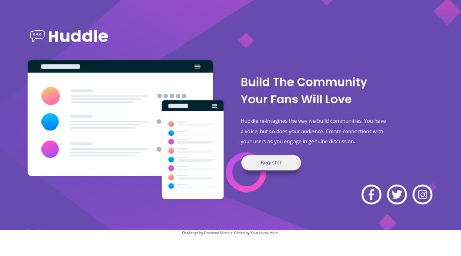
Design comparison
Solution retrospective
Here is my solution! I have tried my best to apply all the advices, tips and suggestions that I have got up to this point. I still am struggling a little when applying the css grid / css flex and be responsive as much as possible. Critique, advice, tips are very much appreciated!
Note: updated the bug on the html! sorry about that!
Community feedback
- @ApplePieGiraffePosted over 3 years ago
Hello there, Go Ushiyama! 👋
Good effort on this challenge! 👍
I suggest,
- Transitioning to a mobile-friendly layout a little sooner than 800px since things look a little squeezed in the hero section of the page right before the layout changes, then.
- Adding the background image in this challenge to the
<body>
and making sure it fills the entire screen at all times by addingmin-width: 100vh
(to make sure the<body>
is always at least as high as the screen) andbackground-size: cover
(so that the background images fills up its container and is clipped (not stretched or squeezed) in order to do so) to the<body>
. - CSS grid is a powerful layout tool but for a simple layout like this, flexbox might be a little easier. You can make the
<body>
of the page a flex container and setflex-direction
tocolumn
to lay the header, hero section, footer, and attribution of the page from top to bottom (assuming they are direct children of the<body>
, then). You can then use flexbox to layout the two parts of the hero section and use a media query to change theflex-direction
when necessary in order to make your page responsive.
Hope those tips help. 🙂
Keep coding (and happy coding, too)! 😁
1@Enoah35Posted over 3 years ago@ApplePieGiraffe Hello! Thanks again for the feedback! I will see to apply the suggestions to my solution see how it goes. At first I thought about using flex too since this is not a multi dimensional layout, but for some reason it did not respond to the responsiveness when I changed the flex-direction using media query.
Haven't thought about using the body as the container! I will re-try from scratch see how it goes. Thank you again!
1@ApplePieGiraffePosted over 3 years ago@Enoah35
No problem! 👍
Yeah, for larger projects, I usually create separate containers for different sections, but for a smaller project such as this I sometimes just simplify things and use the
<body>
. It's up to you, though. 🙂Keep it up! 😀
0
Please log in to post a comment
Log in with GitHubJoin our Discord community
Join thousands of Frontend Mentor community members taking the challenges, sharing resources, helping each other, and chatting about all things front-end!
Join our Discord